Site Checkups report
thisstuffisamazing.com
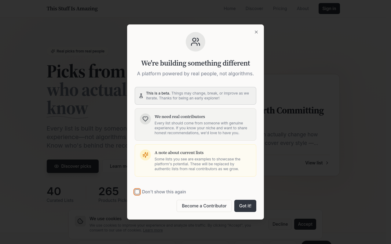
The whole pitch is "picks from people who actually know," yet no list names its person and the beta note admits some lists are examples.
Held back
The whole pitch is "picks from people who actually know," yet no list names its person and the beta note admits some lists are examples.
4 points from 1 blocker. 1 blocker can stop people from buying, and 11 things make people hesitate. The grade weighs each blocker by how serious it is.
Fix these first
In order. Each one keeps its number where it appears in the report.
- Fix first, number 1Blocker, 4 of 5The site's whole reason to exist is trusted, named humans, yet no curator, credential or face appears on the homepage, and the beta notice admits some lists are examples.
- Fix first, number 2Trust gapNo affiliate or commission disclosure appears in the visible text, even though "Affiliate Programs" sits in the footer. For a site claiming honesty over paid rankings, that silence is what skeptics notice.
- Fix first, number 3Button problemReaders and contributors are addressed with similar-weight calls ("Discover picks," "Become a Contributor") and the text doesn't make clear which audience the page is mainly for, so neither feels like the obvious next step.
Conversion blockers· 1
The promised experts are never shown, and some lists are placeholders.
The grade comes from these alone, each weighted from 1 (minor) to 5 (critical).
- Fix first, number 1
The site's whole reason to exist is trusted, named humans, yet no curator, credential or face appears on the homepage, and the beta notice admits some lists are examples.
Serious, 4 of 5. Many leave over it.
Readers came for expert picks over algorithmic ones. Without a visible person behind any list, the site looks no different from the affiliate listicles it criticizes, and the "examples" admission gives careful readers a reason to dismiss every list.
The principle behind thisSocial ProofWhen people aren't sure what to do, they look at what people like them did.The research behind it →
How your page reads
What a first-time visitor takes away
To a first-time visitor
It reads like a curated product recommendation site with a nice anti-algorithm angle. Then a visitor scans the lists looking for the "people who actually know" and finds category tags and "Our favorite" instead of names. Anyone who sees the beta popup saying some lists are "examples" has a good reason to stop trusting the picks.
In the first five seconds
Product recommendation lists in categories like productivity and fitness, supposedly written by people with real experience.
What visitors think you offer
Trustworthy, expert-written buying guides for everyday gear, free to read.
What you actually offer
A beta platform of curated product lists, some of which are placeholder examples. It's also recruiting contributors and appears to have a paid tier ("Pricing" in the nav) and affiliate programs.
The page sells real experts while admitting some lists are examples.
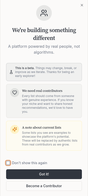
The headline promises picks from people who know, but the beta note says "Some lists you see are examples to showcase the platform's potential." A visitor who reads that can't tell which lists are real, so the core promise collapses for all of them.
"See who made each list" appears under "Transparent & Honest," but every list card on the homepage shows "Our favorite" rather than a person. That first-person "Our" makes the picks feel like the site's own editorial, the opposite of the community-expert pitch.
The featured sourdough list opens with "Elevate your sourdough baking game... making every loaf a masterpiece," generic phrasing that sounds exactly like the algorithmic content the site says it isn't.
The principle behind thisProcessing FluencyThe easier something is to read and take in, the more people like it, and the more likely they are to believe it.The research behind it →
What's working· 2
Keep these as they are
The H1 "Picks from people who actually know" plus "not algorithms or paid rankings" gives a clear reason to prefer this over a generic best-of search result.
List blurbs like "There's no universal best; it depends on how you practice" read like a person with opinions, which supports the human-curation claim better than the headline does.
Visitor hesitations· 4
Visitors can't tell who earns money from these picks.
Does someone get paid when I buy these?
The footer lists "Affiliate Programs" and the hero says "not paid rankings," but the homepage never says whether the links earn commission.
Why is there a Pricing page on a recommendation site?
A reader can't tell from the homepage whether reading lists costs money or who pricing is for.
Who are these real people, and why should I trust them on headphones?
The "40 Curated Lists" and "265 Products Picked" stats count content but say nothing about who wrote it.
Should I bother contributing to a beta that might break?
The note "Things may change, break, or improve" plus no mention of what contributors get leaves would-be writers unsure what's in it for them.
Trust gaps· 2
No named curator, credential or disclosure appears anywhere visible.
- Fix first, number 2
No affiliate or commission disclosure appears in the visible text, even though "Affiliate Programs" sits in the footer. For a site claiming honesty over paid rankings, that silence is what skeptics notice.
"Fresh picks from our community" implies an active community, but no contributor count, testimonial or named member backs it up, which matters more after the beta note.
The principle behind thisSocial ProofWhen people aren't sure what to do, they look at what people like them did.The research behind it →
Button problems· 2
Two audiences get competing buttons with vague labels.
- Fix first, number 3
Readers and contributors are addressed with similar-weight calls ("Discover picks," "Become a Contributor") and the text doesn't make clear which audience the page is mainly for, so neither feels like the obvious next step.
The principle behind thisHick's LawThe more choices people have, and the harder they are, the longer it takes to decide.The research behind it → "Learn more," "Learn More" and "Read about our approach" appear in several places without saying what's behind them, so visitors can't tell if they lead to the same page or different ones.