Teardown · artisanpdfstudio.com
A clear page with no sales yet: artisanpdfstudio.com
The review found nothing blocking a purchase and gave it an A. Strangers still haven't bought. Here's what the report says is missing, and what the Growth Plan would change.
By Synergy · Report run November 11, 2026
Artisan PDF Studio is one of our own sites. It sells printable PDF templates: certificates, lesson plans, planners, invoices. You type your name into the template, pick a color and print it at home. The plain version of every design is free, and the version with your own words and colors costs $4 to $12, paid once.
It opened in September. Since then the only paid orders have been our own tests. The page gets visitors, so we ran Site Checkups on it to find out why none of them buy.
The answer isn't a broken page. The review found no conversion blockers at all. What it found are three small surprises at the moment of buying, and a shop that nobody else vouches for yet.
What to check on your own site
The report gave artisanpdfstudio.com an A (0 points from conversion blockers; how the grade works). These are the findings most homepages share.
- 1
Say the price your button will show
The headline area says "from $4". The first button a visitor sees says $7. Nothing is wrong with either number, but a visitor who anchored on $4 meets a higher one at the first decision, with no reason given. If your prices vary, name the range near the top and say which one this is.
- 2
Show what free leaves out
The free version comes in one color with a small credit line. The page lets you click other colors right before the buttons, and it never shows the credit line. Visitors guess, then feel tricked when the download doesn't match what they picked. Show the difference before they choose, at real size.
- 3
Clear isn't the same as trusted
The page explains itself well, which is why it scored an A. But a stranger has only the shop's own word that the templates print well. Before reviews exist, a photo of a real test print or a few early users' printed pages does the job a testimonial would.
The report, as it came out
Everything above "Growth Plan" is in the free report. Nothing below is edited. A line in [brackets] is the plan asking the owner for something it couldn't find on the site. The AI wrote the report; the lessons above are where a person read it and decided what mattered, which is how Site Checkups is meant to be used (you're the judge).
Nothing on this page stops people from buying, but 7 things make people hesitate. The grade counts blockers only.
Fix these first
- 1
Trust gap
There are no reviews, customer counts, testimonials or named teachers or businesses using the templates. For a $4 to $7 purchase the risk is small, and the free version and refund promise cover most of it. Still, a first-time visitor has only the shop's own claims about quality ('printed before it goes in', 'prints true').
- 2
Button problem
The color theme names (Ledger, Studio, Gilt, Forest, Plum, Terracotta) appear as buttons right before the purchase buttons. The page says color is part of the paid version, but a visitor may click a theme expecting the free download to use it, then learn it only comes in Ledger.
- 3
Hesitation
'Thirty-two designs' across seven drawers is modest, and some drawers hold only 2 or 3. Someone looking for a specific certificate or invitation style may wonder whether the range is wide enough to bother browsing.
Conversion blockers
What stops people from signing up or buying. The grade comes from these, weighted from 1 (minor) to 5 (critical).
None found. Nothing on this page should stop someone who came to buy.
How your page reads
To a first-time visitor
It's clear fast: printable PDF templates you personalize in the browser, with a free plain version and paid versions from $4. The page reads calm and honest, with prices shown up front and a live template to type into. The main reason someone leaves is that nobody else vouches for it, so a stranger is taking the shop's word on quality.
In the first five seconds
PDF templates (certificates, planners, invoices, lesson plans) that you customize with your name and a color, then print. Free plain version, paid version from $4, one-time payment.
What visitors think you offer
A small shop of printable, customizable PDF templates for teachers, small businesses and home use, with a free tier and cheap one-time purchases.
What you actually offer
32 templates across seven categories, customized in the browser and downloaded in Letter and A4. The free version comes in one theme (Ledger) with a credit line. Paid ($4 to $7 per template, once) adds 8 color themes and removes the credit. There's a refund if the file doesn't match the preview, a public font license log, and a monthly email that includes a free paper set.
Where the page and the offer don't match
- The hero says 'from $4' but the featured template's button says $7. A visitor who anchored on $4 meets a higher price at the first decision point, and the page doesn't say why this one costs more.
Visitor hesitations
The doubts running through someone's head right before they leave.
- 'Thirty-two designs' across seven drawers is modest, and some drawers hold only 2 or 3. Someone looking for a specific certificate or invitation style may wonder whether the range is wide enough to bother browsing.
- Teachers and small businesses will ask whether they can use the files commercially or share them with colleagues. There's a License link in the nav, but the homepage doesn't say what the license covers.
- The free version is 'one theme and a small credit line.' Visitors may wonder how visible that credit is on a certificate or invitation before deciding whether free is good enough or worth paying to remove.
Trust gaps
Proof a careful visitor looks for and doesn't find.
- There are no reviews, customer counts, testimonials or named teachers or businesses using the templates. For a $4 to $7 purchase the risk is small, and the free version and refund promise cover most of it. Still, a first-time visitor has only the shop's own claims about quality ('printed before it goes in', 'prints true').
Principle: Social Proof → - No person or studio name stands behind 'designed by hand.' The craft story is the whole pitch, yet the visitor can't see who the maker is.
Button problems
Buttons and links that are unclear, compete with each other, or ask too much too soon.
- The color theme names (Ledger, Studio, Gilt, Forest, Plum, Terracotta) appear as buttons right before the purchase buttons. The page says color is part of the paid version, but a visitor may click a theme expecting the free download to use it, then learn it only comes in Ledger.
Growth Plan
The paid part: $19, one-time, for one site. Shown here in full. Before it's written you answer five quick questions, so the plan fits your business. Here's what we answered:
- Goal: buy something
- Visitors a month: under 500
- Customers so far: none yet
- For: teachers, small businesses and families who print at home
- Avoid: anything that needs a name or a face (we stay anonymous)
- Avoid: paid ads
Facts also taken from the site's own pages: /help/, /templates/, /license/
Start here: Fix the $4 vs $7 mismatch and make the hero template a $4 one, or explain the tiers
- 1Change the hero line 'Yours is from $4, paid once.' to 'Yours is $4, $7 or $12, paid once. The price shows on every design before you start.' The templates page already lists $12 items (Letterhead, Price List, Menu, Wedding Invitation), so 'from $4' undersells the range and sets up the surprise.
- 2Next to 'Make it yours · $7' add one short line saying why this design is $7, for example: '$7 designs have more fields to fill in. Simpler sheets are $4.' Adjust the wording to whatever actually sets the tier.
- 3Move the color theme buttons (Ledger, Studio, Gilt, Forest, Plum, Terracotta) under a label that says 'Paid colors, preview them free' so nobody clicks Forest expecting a free Forest download.
- 4Under the free button, add a small preview or a one-line description of the credit line, for example: 'Free version: Ledger theme, with a one-line credit at the bottom of the page.' Then people know what they're choosing between.
- 5Put the all-access pass on the homepage under 'See all 32 templates': 'Or every template for a year, $49, paid once.' Right now it's only on the templates page.
You have no customers and under 500 visitors a month, so each visitor who gets to the buy button matters. The first price they see on the page ($4) doesn't match the button ($7), and the color buttons look free when they aren't. That doubt hits at exactly the point where someone is about to pay for the first time. Fixing it costs an hour and makes your existing honesty claim ('The price is on the page before you start') actually true at a glance.
Quick wins: change these words
Hero price line
NowThe plain version is free. Yours is from $4, paid once.
Change toThe plain version is free. Yours is $4 to $12, paid once. This certificate is $7.
It matches the red button, so nobody who anchored on $4 is surprised at the moment they decide. The $12 top price comes from the Templates page (Letterhead, Menu, Wedding Invitation).
Line under the purchase buttons
NowDoesn't match the preview? Email us and we'll refund it.
Change toDoesn't match the preview? Email hello@artisanpdfstudio.com and we'll refund it.
You have no reviews yet, so this guarantee is your main trust signal. Giving the real address (from the License page) makes it read as a promise someone actually answers, without naming you.
Just below 'Paid adds all 8 color themes…'
NowNo mention of commercial use on the homepage.
Change toBuying a template lets you use it in your business: send the invoices, hand out the certificates, no limit on prints. See the license.
Teachers and small businesses are two of your three audiences, and 'can I use this for work?' blocks the purchase. The answer is already on your License page, so put it where people decide.
'A real free version of every design.' block
NowOne theme and a small credit line, in Letter or A4. That is the whole difference.
Change toOne theme and a small credit line, in Letter or A4. That is the whole difference. [Add a close-up image of the credit line on a printed certificate, actual size]
People will wonder how visible the credit is. Showing it lets them judge for themselves and decide whether $7 is worth removing it. Without customers, sample output is the proof you can show.
'How we make them' section heading
NowDesigned by hand, checked on paper.
Change toDesigned by hand, checked on paper. [Add one photo of printed sheets with a ruler on them, no faces]
'Printed before it goes in' is a claim. A photo of real printed pages and a ruler checking the margins backs it up without breaking your rule about staying anonymous.
'Latest off the press' section, below the six cards
NowNo link to sets or the pass.
Change toNeed several? Sets from $15, or every template for a year for $49, paid once. See sets.
Sets and the pass are listed on the Templates page but invisible from the homepage. A teacher who wants a lesson plan, a reading log and a sign-in sheet will spend more and feel it's a better deal.
What visitors see first
On a desktop
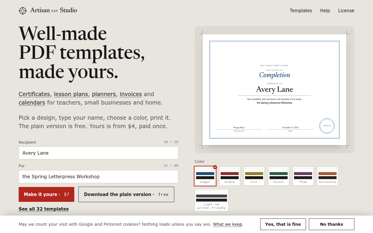
This one works. The serif headline pulls the eye first, then the live certificate on the right, which shows the product better than any copy could. The offer line ('The plain version is free. Yours is from $4, paid once.') is visible, and both buttons, 'Make it yours · $7' and 'Download the plain version · free', sit above the fold. The cookie bar covers the bottom 60px but doesn't hide the buttons. The weak spot is the jump from 'from $4' in the copy to '$7' on the red button a few inches below, with nothing explaining the difference.
On a phone
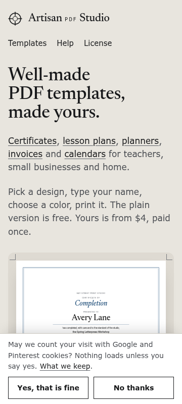
The phone gets the headline, the category links and the price line, then a sliver of the certificate before the cookie banner covers the rest. Neither purchase button nor the Recipient field shows without scrolling. The banner takes about a fifth of the screen, and the nav row ('Templates Help License') pushes the hero down further. A visitor knows what this is but has no reason to act yet and no visible button to press.
Mobile hero, below the price line
No button above the fold. The first tappable action is the cookie banner, so 'Make it yours' starts out of sight.
Fix: Add a short red button right under 'Yours is from $4, paid once.' that reads 'Try it on a certificate' and jumps to the Recipient field. Or move the form above the preview image on mobile.
Desktop, color swatches beside the preview
The swatches sit right next to the free button with nothing saying they're paid. 'The color is part of the paid version' appears in the page text but isn't visible near the swatches in the screenshot, so someone can pick Plum, hit the free button and get Ledger.
Fix: Put a small line under the 'Color' label: 'Free version comes in Ledger. Other colors come with the paid file.' Show a tiny lock or '$' on every swatch except Ledger.
Desktop buttons row
'Make it yours · $7' and the free button are close in visual weight. The outlined free button is wider and its text is longer, so it competes with the paid one.
Fix: Shorten the free button to 'Free version' and keep it outlined. Let the red paid button be the widest thing in the row.
Cookie banner, both layouts
On mobile it takes about 140px and covers the preview. 'Yes, that is fine' and 'No thanks' look equally weighted, which is fair, but the banner's height is the problem.
Fix: Cut the copy to one line: 'Count your visit with Google and Pinterest cookies? What we keep.' Keep both buttons side by side so the bar is roughly half its current height on phones.
Three ways to write the hero
Outcome, made yours
Printable templates with your name already on them.
Certificates, lesson plans, invoices, planners and calendars. Type your name, pick a color, print at home in Letter or A4. The plain version is free. Yours is from $4, paid once.
Pick a templateUse it when: Use this if most visitors land from searches for a specific template and just want to know they can personalize it fast.
Problem with freebies
Free templates that actually fit the page when you print them.
Every design here is printed on a home printer at 100% before it goes up. If your name is too long for its line, the download waits until it fits. Free plain version, paid version from $4.
Try one freeUse it when: Use this if your visitors have been burned by Pinterest or Etsy files that print shrunk, cut off or blurry.
Proof by guarantee
Try it free. Pay $4 only if you want it in color.
Type into the real template right here. The free file comes in one theme with a small credit line. The paid one adds 8 color themes and drops the credit. Doesn't match the preview? We refund it.
Type your name inUse it when: Use this while you have no reviews yet, since it puts the free version and the refund promise in front of the stranger's doubt.
Button and link text
Featured template, paid button
Make it yours · $7Download in color, no credit line · $7
Featured template, free button
Download the plain version · freeDownload free (Ledger theme, small credit line)
Color theme buttons above the purchase buttons
Ledger Studio Gilt Forest Plum TerracottaAdd a label above them: "Preview a color (paid version). Free comes in Ledger."
Link under the featured template
See all 32 templatesBrowse all 32 templates, each with a free version
Email signup button
Send me the free paper setEmail me the free paper set
Nav link
LicenseCan I use it for my business?
The checklist
This week
Add a two-line license note above 'How we make them': 'Bought a template? Use it in your business or classroom: send the invoices, hand out the certificates, no print limit. Full license in plain words →' Link it to /license/.
Effort: low · Impact: high
Teachers and small businesses are two of your three audiences, and both will wonder about commercial use. Your license page already gives the answer. Put it where the buying decision happens.
Give a printed, unedited sample to 5 people from your audience (a teacher, a café owner, a parent) in exchange for one honest sentence and permission to quote it by role, e.g. '3rd-grade teacher, Ohio'. Then show those quotes under 'Latest off the press'.
Effort: med · Impact: high
You have no reviews yet and you're staying anonymous, so your first proof has to come from other people. Quoting by role and place keeps it credible without using names or faces.
Rename the studio's voice in 'Designed by hand, checked on paper.' to include process detail instead of a person: 'Every template is printed on a [printer model] at 100%, measured with a ruler, and reprinted until the margins match.' Fill in the bracket.
Effort: low · Impact: med
The diagnosis flagged that there's no maker behind 'designed by hand.' You don't want to show a face, so concrete process details have to do that job.
Next
Add a short 'Your first order' strip near the buy button: 'Pay once, download Letter and A4 straight away. Doesn't match the preview? Email hello@artisanpdfstudio.com and we'll refund it.'
Effort: low · Impact: med
The refund promise is there now, but it's buried in a small line. For a first-time buyer from a shop with no reviews, it's your strongest guarantee.
Once you have 10 paying customers, email each one a single question: 'What did you print it for?' Put the best three answers on the page as small use cases (a wedding with 80 place cards, a term's lesson plans).
Effort: med · Impact: high
Real use cases answer the '32 designs isn't many' worry better than adding more templates. They show that the ones you have actually get used.
Link the Help articles from the homepage with a line like 'Never printed at actual size? Five-minute guide →'.
Effort: low · Impact: low
Nervous home printers worry about whether things will print right. Your Help page already answers that, and showing it to them lowers the risk they feel before paying.
In your account you tick these off as you go, and your dashboard shows your progress and the next fix.
FAQ answers for the page
Can I use these for my classroom or my business?
Yes. Any template, free or paid, is fine for you, your family and your home. Buying a template also lets you use it in your own business with no cap: send the invoices, hand out the certificates. You just can't resell the template itself. Full terms are on the License page.
How visible is the credit line on the free version?
It's a small line on the page, and the free file comes in one theme (Ledger). Download the free one first and look at it on paper. If it's fine for your use, keep it. If not, the paid version removes it.
Why does this one cost $7 when the top says from $4?
Simple one-page sheets like a reading log or habit tracker are $4. Designs with more layout work, like certificates and lesson plans, are $7, and a few like letterhead and wedding invitations are $12. Every price is shown before you start.
What if it prints wrong?
Every template is test-printed on a home printer at 100% before it goes up. Set your printer to actual size, not "fit to page" (the Help page shows where). If the file doesn't match the preview, email us and we'll refund it.
Is this a subscription?
No. You pay once per template and the file is yours to print as often as you like. If you want everything, there's an all-access pass for $49, paid once, covering every template for a year.
How it shows up in search and shared links
artisanpdfstudio.com
Custom Printable PDF Templates, Free Version | Artisan
Certificates, lesson plans, invoices and planners you personalize in the browser and print at home. Free plain version. Your color version from $4, once.
Making these changes in your site builder
- 1
Change the hero headline and subheadline
Open the page editor for your homepage (in Squarespace, Wix, Webflow or WordPress it's usually Pages > Home > Edit). Click the H1 "Well-made PDF templates, made yours." and paste your chosen headline. Click the paragraph under it and paste the matching subheadline. Save or Publish.
- 2
Rename the two featured-template buttons
Click the "Make it yours · $7" button, open its settings (gear or pencil icon) and replace the label text. Do the same for "Download the plain version · free". Keep the links as they are. Check the longer labels don't wrap badly on mobile using the phone preview icon.
- 3
Add a label above the color theme buttons
Hover just above the Ledger/Studio/Gilt row, click the + or Add Block option, choose Text, and type: "Preview a color (paid version). Free comes in Ledger." Make it small and place it directly above the buttons.
- 4
Add a short license line near the buy buttons
Add a Text block under the two download buttons with: "Paid templates are licensed for your own business use, no print limit. See the license." Highlight "See the license", click the link icon, and point it to /license/.
- 5
Add an FAQ section above the email signup
Add a new section (Add Section or + between sections), pick an FAQ, Accordion or Toggle block if your builder has one, or plain text headings if not. Paste the five questions and answers. Place it just above "One new template a month." and publish.
- 6
Update the page title and meta description
Find the page's SEO settings (Squarespace: page gear > SEO; Wix: Pages > Home > SEO basics; WordPress: the Yoast or Rank Math box under the editor; Webflow: page settings > SEO). Paste the new title and description, save, then republish the site.
Tests worth running
- Five-second test: show the homepage to 5 teachers or parents for five seconds, then ask what it costs and what's free. If anyone says 'everything is $4' or 'colors are free', the price and theme fixes aren't clear enough yet.
- Watch 3 people from your audience try to buy one specific thing (e.g. 'a certificate for your class with your school name'). Note where they hesitate or click the wrong thing. At under 500 visitors a month, this tells you more than any split test would.
- Three 15-minute calls with people who downloaded a free version: ask why they didn't pay. Their exact words become your next headline or FAQ.
Then, a free re-check
Within 30 days of buying, run one free re-check. We read the page again and tell you what's fixed, what's still open and anything new, with the number of conversion blockers before and after. You can also copy the whole plan as text, save it as a PDF, and we email you a copy.
Want a second pair of eyes?
Paste your homepage and see what a stranger sees. Free, in under a minute.