Teardowns

Teardown · designisnotui.com

The essay never says who's behind it: designisnotui.com

The review gave it an A: nothing stops a reader. But the page's goal is a click through to Synergy, and it never says what Synergy is. This is the third review we ran that day. The first two never read the ending, and that was our reader's fault.

By Synergy · Report run November 15, 2026

The grade: A, clear
No blockers, so no points against it. Jump to the report

Design Is Not UI is one of our own sites: a single long essay arguing that design is the judgment about what to build, and that a prompt isn't a strategy. It sells nothing. There's no sign-up, no price and no form. We told Site Checkups that the one thing we'd like a reader to do at the end is click through to synergyprod.com, and let it grade the page against that.

A report grades a page against the goal you give it, and this one shows the difference. As an essay to read and pass on, the page does its job. The report lists its closing line, "If you keep having this argument at work, share this page and let it make the case for you", as a strength. As a way to send readers to Synergy, it has a gap. Synergy's name is in the small logo at the top, in the footer, over the list of principles and in one closing link, and nowhere does the page say what Synergy is.

It got an A, with no blockers. The report makes the same two points in several places: the page never says what Synergy is, and it names no author, on a page that says judgment "is earned over years".

This is the third review we ran on the page that day, and the first we could publish. The first two never read the ending. Our reader passed along the first 10,000 characters of a page, and this essay runs about 850 words past that. So the reviewer judged the ending from a bare list of its links. It called the link to the companion essay "unexplained" when the page explains it twice, and it said the four example phrases were buttons that do nothing when a click copies them. In the first plan, all three things to do that week were already true of the page. Those runs gave it a C and then a B.

We didn't publish those. We changed the reader. On a page too long to pass whole, the reviewer now gets the start and the end and is told how much of the middle it skipped. It's also told it can't click anything, so it shouldn't guess what a button does. Then we ran it again. This report had the ending in front of it: it quotes the closing line, it knows the companion essay is a companion, and about the phrases it says what's true, that the text doesn't show what a click does. (A click copies the phrase. On a phone nothing tells you so, which makes the plan's "Tap to copy" label a fair idea.)

One finding is still wrong. The plan's notes on the screenshots say there is no link to synergyprod.com anywhere on the first screen. The logo at the top left is one. A screenshot can't show what's a link, and the plan knows better further down, where it mentions "the unlabeled logo". We left it all as it came out.

What to check on your own site

The report gave designisnotui.com an A (0 points from conversion blockers; how the grade works). These are the findings most homepages share.

  1. 1

    Say what's on the other side of the link

    "Learn more about Synergy" is the one link that invites a reader to the company, and nothing before it says what Synergy is. A reader who just spent ten minutes agreeing has no idea what they'd find. The plan's main fix is one plain sentence above the link: what Synergy is, and the one thing this reader would want there. Look at your own "Learn more" links and ask what a stranger expects behind each one.

  2. 2

    Put a name on strong opinions

    The essay says judgment is earned over years and never says whose years. The report raises it twice, and notes that it matters most when a reader forwards the page to a skeptical boss. The plan asks for a byline under the headline, or one line saying who the team is. If your page argues from experience, show whose it is.

  3. 3

    Answer the question where you ask it

    Near the top the page asks "What's this?" and answers "Scroll down to find out." The explanation sits in a section most readers never reach. The plan answers it on the spot, in one line. If your page raises a question, don't make the answer a reward for scrolling.

The report, as it came out

Everything above "Growth Plan" is in the free report. Nothing below is edited. A line in [brackets] is the plan asking the owner for something it couldn't find on the site. The AI wrote the report; the lessons above are where a person read it and decided what mattered, which is how Site Checkups is meant to be used (you're the judge).

Site Checkups report

designisnotui.com

Clear

A sharp, well-argued essay that earns agreement, but the only path to Synergy is a closing link that never says what Synergy sells.

No blockers, so no points against it. Nothing on this page stops people from buying, but 7 things make people hesitate. The grade counts blockers only.

Fix these first

In order. Each one keeps its number where it appears in the report.

  1. Fix first, number 1Trust gapAn essay built on "Strategic judgment is earned, not installed" asks readers to trust earned experience, yet the shown text offers no named author, bio or track record to back the voice, which weakens it as something to forward to a skeptical boss.
  2. Fix first, number 2Button problem"Learn more about Synergy →" is the only path to the company, and since the page never says what Synergy offers, readers who liked the essay have no reason to expect anything specific on the other side.
  3. Fix first, number 3Hesitation“Who is actually saying this?” The essay speaks as "we" and leans on experience ("Judgment is not a tool. It is earned over years"), but the shown text names no person whose years those are.

Conversion blockers· 0

Nothing here stops someone who came to buy

The grade comes from these alone, each weighted from 1 (minor) to 5 (critical).

None found. Nothing on this page should stop someone who came to buy.

How your page reads

What a first-time visitor takes away

To a first-time visitor

This reads as a confident manifesto, not a sales page, and "10 min read" sets that expectation early. Designers who've been arguing this point at work will feel seen and keep scrolling. People looking for a product or service will leave fast, because nothing up top says one exists.

In the first five seconds

It's an opinion essay arguing that design is judgment and strategy, not screens, and that AI can't replace that judgment.

What visitors think you offer

A free essay defending product design against AI-first thinking, meant to be read and shared.

What you actually offer

A free position essay from Synergy, which also publishes a design principles library and a companion essay, "It's OK to be human", with a link to learn more about Synergy.

Readers finish knowing the argument but not what Synergy is.

  • Synergy appears only in the footer, the principles section and "Learn more about Synergy →", and the shown text never says whether Synergy is a studio, a product or a publisher, so interested readers can't judge if following up is worth a click.

  • The "What's this? Scroll down to find out." teaser promises an explanation of the page itself, and readers who don't reach the "What This Is" section may never learn who's behind it.

What's working· 3

Keep these as they are

  • The opening lines "UI is what a product looks like. Design is the judgment about what it should be, and why." state the whole position in two sentences, so readers know instantly whether they agree.

  • The closing "If you keep having this argument at work, share this page and let it make the case for you." gives the target reader a concrete reason to act, matching the page's real goal.

  • Citing Des Traynor, Jared Spool, Roger Martin and Julie Zhuo, plus Synergy's own principles pages, makes the argument feel researched rather than opinion.

Visitor hesitations· 2

Readers can't tell who wrote this or why.

  • Fix first, number 3Who is actually saying this?

    The essay speaks as "we" and leans on experience ("Judgment is not a tool. It is earned over years"), but the shown text names no person whose years those are.

  • Are these quote buttons something I click?

    Lines like "What user data led us to this specific layout?" are listed as buttons, and the text doesn't make clear whether they copy, expand or just display.

Trust gaps· 1

The essay has no named author behind its strong claims.

  • Fix first, number 1

    An essay built on "Strategic judgment is earned, not installed" asks readers to trust earned experience, yet the shown text offers no named author, bio or track record to back the voice, which weakens it as something to forward to a skeptical boss.

Button problems· 2

The Synergy link asks for interest without saying what's there.

  • Fix first, number 2

    "Learn more about Synergy →" is the only path to the company, and since the page never says what Synergy offers, readers who liked the essay have no reason to expect anything specific on the other side.

  • "Share" and the link to "It's OK to be human" sit in the same closing stretch as the Synergy link, and the text doesn't make clear which of the three the page most wants, so the company link competes with two easier actions.

The paid part

Growth Plan

$19, one-time, for one site. Shown here in full. Before it's written you answer five quick questions, so the plan fits your business. Here's what we answered:

  • Goal: go to synergyprod.com
  • Visitors a month: under 500
  • Customers so far: none yet

Start here

Tell readers what Synergy is right where they decide to click

  1. Directly above "Learn more about Synergy →", add one plain sentence saying what Synergy is and what's on synergyprod.com. Example shape: "Synergy is [what Synergy is: studio, product or publisher]. At synergyprod.com you'll find [the one thing a reader of this essay would want there]."

  2. Change the link text so it names the destination: "See what Synergy does →" or "Browse Synergy's design principles →" if the principles library is the best first stop.

  3. Add the same one-line description to the footer, so "© 2026 Synergy" becomes "© 2026 Synergy · [one-line description]" and links to synergyprod.com.

  4. In "The evidence underneath" section, add a short line after "Synergy keeps that research, source by source, in its design principles": "All 40+ are free at synergyprod.com/principles." Only keep the number if it matches what's actually there.

Why this first

Your goal is clicks to synergyprod.com, and right now the only door there asks readers to be curious about a name the essay never explains. People who just spent 10 minutes agreeing with you are your warmest traffic. One sentence of context turns "Learn more" from a gamble into an obvious next step, and it doesn't touch the manifesto tone you chose on purpose.

Quick wins· 5

Change these words

  • Eyebrow above the headline

    Now

    A position on product design

    Change to

    A position on product design, from Synergy

    Puts the publisher's name in the first line people read, so the closing Synergy link isn't the first time they meet the name.

  • Closing link

    Now

    Learn more about Synergy →

    Change to

    See what Synergy does: [one line on what Synergy offers] →

    Readers who agreed with the essay need to know what's on the other side before they click. Fill the bracket with Synergy's actual offer.

  • "The evidence underneath" section

    Now

    Synergy keeps that research, source by source, in its design principles.

    Change to

    Synergy keeps that research, source by source, in its free library of design principles at synergyprod.com. Each one links the original studies.

    This is the strongest moment of interest in Synergy. Naming the domain and saying it's free turns a reference into a reason to go there.

  • Byline under "10 min read"

    Now

    Scroll to see why the difference matters. • 10 min read

    Change to

    Scroll to see why the difference matters. • 10 min read • By [author name], Synergy

    The essay argues judgment is earned over years. A named author backs that claim and gives readers a reason to check out Synergy.

  • "What's this?" teaser

    Now

    What's this? Scroll down to find out.

    Change to

    What's this? An essay by Synergy, [one line on what Synergy is].

    Answers the question right where it's asked instead of hoping readers reach the "What This Is" section deep in the page.

What visitors see first

Your page before anyone scrolls, on a desktop and a phone

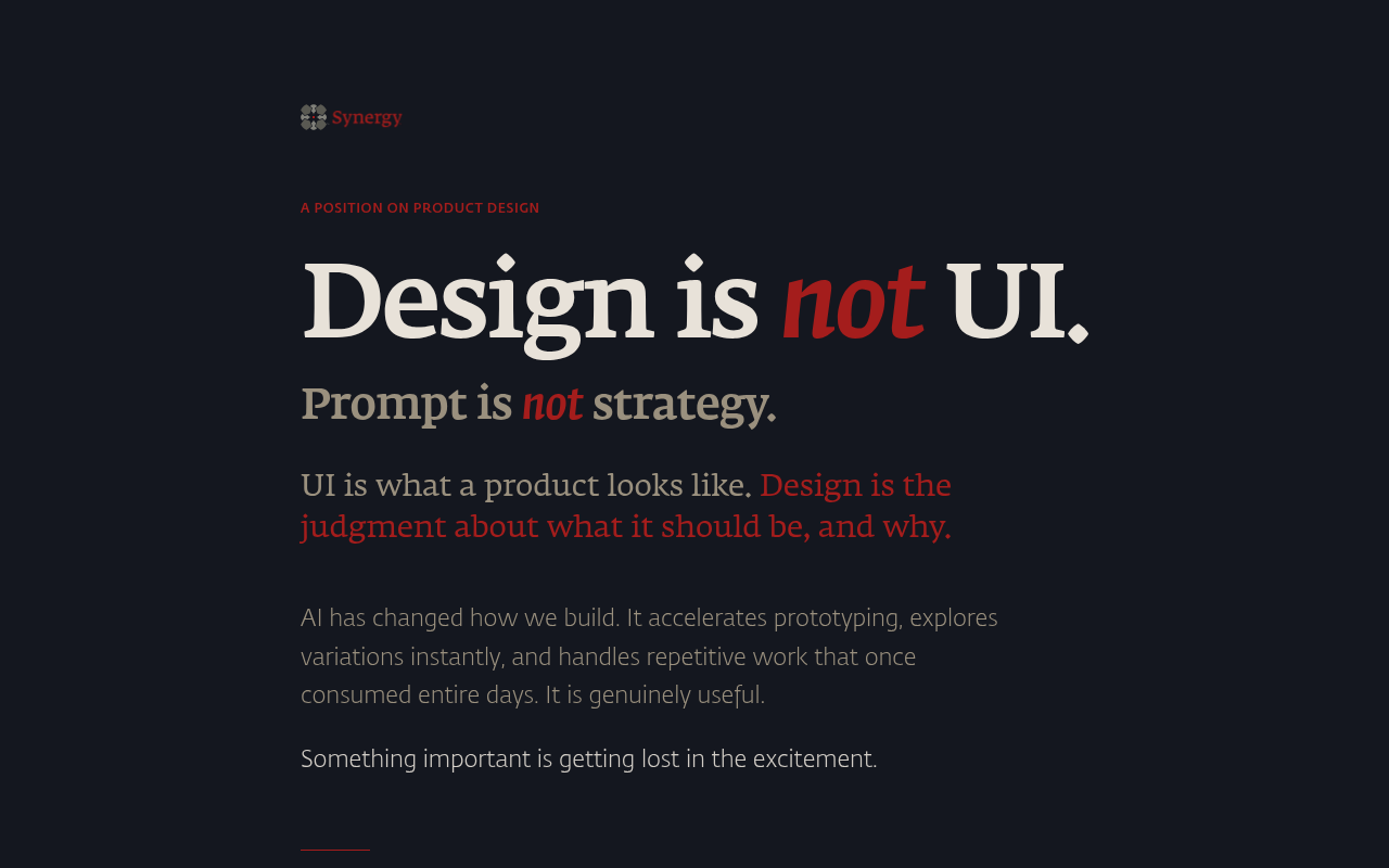
designisnotui.com on a desktop screen, as it first loads
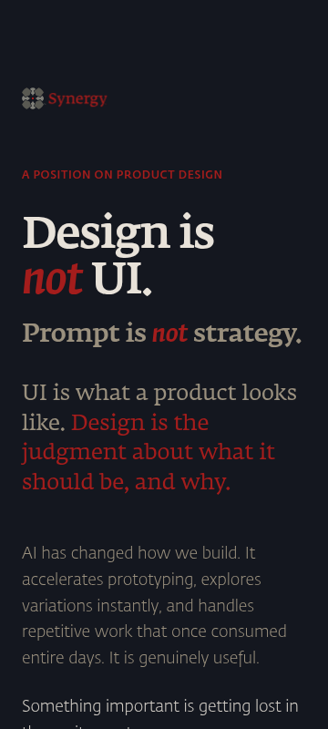
designisnotui.com on a phone, as it first loads

On a desktop

The headline "Design is not UI." grabs the eye first, and the red "not" lands the point in a second. The position is clear. What isn't visible: any sign of what Synergy is or why you'd go to synergyprod.com. The only Synergy mark is a small, low-contrast logo top left. For a page whose goal is sending people to synergyprod.com, the fold gives no reason or path to go there. The top quarter of the screen is mostly empty dark space above the eyebrow.

On a phone

Same story, tighter. The headline and the red definition line read well and the argument is clear. The Synergy wordmark is tiny and dim, nothing says who wrote this, and there's no link or hint of synergyprod.com before the reader commits to a 10 minute scroll. The "Something important is getting lost" line is cut off at the bottom edge, which works as a scroll pull.

  1. 1

    Synergy logo, top left

    The logo is small, dark gray with a muted red wordmark on a near-black background. It's the only Synergy touchpoint above the fold and it nearly disappears, so readers don't register who's behind the essay.

    Fix: Raise the wordmark contrast to the same cream used in the headline and add a short line beside it: "Synergy · product design studio" (or whatever Synergy actually is), linked to synergyprod.com.

  2. 2

    Header row, right side

    The whole right side of the header is empty. There's no link out to synergyprod.com, the one action the owner wants, anywhere in the first screen.

    Fix: Add a small text link in the top right of the header, "About Synergy →", pointing to synergyprod.com. Keep it quiet so the essay still leads.

  3. 3

    Two headlines stacked

    "Design is not UI." and "Prompt is not strategy." sit almost on top of each other with the same pattern and red "not". On phone the second line reads as a continuation rather than a second claim, and the eye hits two near-identical slogans before the actual definition.

    Fix: Add about 16px more space between the two lines on mobile, or drop the subhead size a step so the H1 clearly leads.

Hero options· 3

Three ways to write the top of the page

  • The core position

    Design is not UI.

    UI is what a product looks like. Design is the judgment about what it should be, and why. AI can draw the screens. It can't decide what to build. A 10-minute essay from Synergy.

    Read the argument

    Keep this if most visitors arrive from shares and already know the debate, since the current headline is doing its job.

  • The workplace argument

    Tired of hearing that a good prompt is a strategy?

    This essay makes the case for you: why AI speeds up execution but can't choose the problem, the users or the trade-offs. Read it, then send it to whoever needs it.

    Read the case

    Use this when you're pushing the page to designers who keep losing this argument with AI-first teams.

  • Who's behind it

    Prompt is not strategy. A position from Synergy.

    Synergy is [one line on what Synergy does, e.g. studio, product or library]. This essay is the thinking behind how we work, and why judgment still matters when AI makes screens cheap.

    Read the essay

    Pick this if the goal of sending readers to synergyprod.com matters more than pure shareability, because it names Synergy up front.

Button and link text· 4

What each button should say

  • Closing link to the company, after the companion piece

    Learn more about Synergy →See how Synergy works [fill in: e.g. our studio / our product] →

  • Footer

    © 2026 Synergy · Design is not UI© 2026 Synergy, [what Synergy does in five words] · Design is not UI · synergyprod.com

  • Teaser near the top

    What's this? Scroll down to find out.What's this? An essay by Synergy. Jump to who we are.

  • Principles section intro

    Synergy keeps that research, source by source, in its design principles.Synergy keeps that research, source by source, in its free design principles library on synergyprod.com.

The checklist

What to do this week, and what comes next

This week

  • Add a byline under the H1: "By [name], [role] at Synergy" or, if you'd rather stay unnamed, "Written by the team at Synergy, [what Synergy does]" with Synergy linked.

    Low effort High impact

    The essay argues judgment is earned over years, so readers will ask whose years. A byline at the top also puts Synergy, and a link to it, in front of everyone, including the many who never scroll to the end.

  • Make the "What's this?" teaser answer itself in one line: "An essay by Synergy, [what Synergy does]. More at the end."

    Low effort Medium impact

    A teaser that sends people to scroll for an explanation loses most of them. Answering up front means even quick bouncers learn the name and what it stands for.

  • Link each mention of Synergy in the body text ("Synergy keeps that research", the footer) to synergyprod.com instead of relying on the single closing link and the unlabeled logo.

    Low effort Medium impact

    With under 500 visitors a month, every extra chance to click matters. Inline links catch readers at the moment they're nodding along, not only at the very bottom.

Next

  • In the closing stretch, give the Synergy link its own small block with a visible border, separate from "Share" and "It's OK to be human", so it reads as the main next step.

    Medium effort Medium impact

    Three equal exits at the end split attention, and the company link is the hardest of the three. Keep Share (a listed strength), just let Synergy stand on its own.

  • Make the four principle links (Automation Bias, Subtraction Neglect and the rest) appear where each idea is argued in the body, for example link "Fluent output reads as correct output" to Automation Bias.

    Medium effort Medium impact

    These are already links to synergyprod.com that readers want. Placing them next to the claim they support gets clicked far more than a list at the end.

  • Check the quote lines like "What user data led us to this specific layout?" and add a tiny label that says what clicking them does ("Tap to copy" if that's the behavior).

    Low effort Low impact

    Readers weren't sure if these are buttons. A clear label makes them usable and keeps people engaged through the middle of the essay.

In your account you tick these off as you go, and your dashboard shows your progress and the next fix.

Then, a free re-check

Within 30 days of buying, run one free re-check. We read the page again and tell you what's fixed, what's still open and anything new, with the number of conversion blockers before and after. You can also copy the whole plan as text, save it as a PDF, and we email you a copy.