Teardowns

Teardown · sitecheckups.com

All the proof is our own: sitecheckups.com

The review gave our own homepage an A: nothing on it stops a buyer. It also found that every example is one of our own sites, with no outside customer yet. One quick win in the plan gets our answer backwards, and that was our wording's fault.

By Synergy · Report run November 15, 2026

The grade: A, clear
No blockers, so no points against it. Jump to the report

This one is our own homepage, the page that sells the tool that wrote this report. It offers a free review and a $19 Growth Plan, and it has one job: get a visitor to paste an address into the box. It gets fewer than 500 visitors a month and has no customers yet. We gave the plan those answers, said we stay anonymous, and let it write.

It isn't the first time. On October 18 the review listed four blockers on this page. Part of that was our reader's fault: it stopped after the first 3,000 characters, so the review never saw the price, the refund or the FAQ. We fixed the reader that morning, and a fresh run left three blockers that were fair. Every example was our own site, nobody visible stood behind the advice, and the page was long and repeated itself. We fixed the last two that day.

A month later it gets an A, with no blockers. Not all of that is the page: in between we also made the reviewer stricter about what counts as a blocker. And the one thing we didn't fix is still the first thing the report says. Both examples on the page, bizonlinekit.com and superchargedemail.com, are ours, and the counter on our offer of five free plans still reads "5 of 5 left". The report files that under trust gaps now, and it's half of the verdict.

The plan's main fix is blunt about it: stop waiting for emails, pick five small businesses we can reach, run the free report on each and offer them the plan. This teardown doesn't help with that, since it's one more of our own sites. The plan asks for a teardown of a site we don't own, with the owner's permission. We agree, and we don't have one yet.

One quick win gets our own answer backwards. We told the plan we stay anonymous. Under "Who's behind it" it says "You've said you don't want to stay anonymous" and asks for a first and last name and a photo. Three items later it has it right: "You won't show a name or face, and that's fine." The mistake was in how we passed the answer along. The reviewer was handed it as "Avoid: staying anonymous", which can be read either way, and part of the plan read it the wrong way. We've reworded it. The plan also wants a line saying the studio has been "running small sites since 1998". The page says the studio has been around since 1998, which isn't the same thing. We left it all as it came out.

What to check on your own site

The report gave sitecheckups.com an A (0 points from conversion blockers; how the grade works). These are the findings most homepages share.

  1. 1

    Your own examples only prove so much

    Both sample reports on the page come from sites we own, and a visitor can tell. A skeptical buyer has only our word that the method works on a bakery or a plumber. The plan doesn't wait for proof to arrive. It says to pick five reachable businesses of different kinds, do the work for them, and publish what each one says. If every example on your page is your own, go and earn the first outside one this week.

  2. 2

    Keep the free version away from the buy button

    Right after the $19 price, the page offers the same plan free to five small businesses. Someone ready to pay now has a reason to email and wait. The plan moves the free offer away from the price and tells buyers which path is the fast one. If you run a giveaway or a beta, keep it out of the place where people decide to pay.

  3. 3

    Say what the paid part adds, at the price

    The FAQ calls the free report "the full diagnosis". That's true, and it leaves a visitor asking what's left to pay for. The page does answer that, in a paragraph above the price. The plan puts it in two labeled lines: the free report says what's wrong, the $19 plan writes the fixes. If you have a free tier, the line between free and paid belongs where the price is.

The report, as it came out

Everything above "Growth Plan" is in the free report. Nothing below is edited. A line in [brackets] is the plan asking the owner for something it couldn't find on the site. The AI wrote the report; the lessons above are where a person read it and decided what mattered, which is how Site Checkups is meant to be used (you're the judge).

Site Checkups report

sitecheckups.com

Clear

The page explains its free report and $19 plan clearly, but the only proof comes from the maker's own sites, so outsiders can't judge results.

No blockers, so no points against it. Nothing on this page stops people from buying, but 5 things make people hesitate. The grade counts blockers only.

Fix these first

In order. Each one keeps its number where it appears in the report.

  1. Fix first, number 1Trust gapBoth examples, bizonlinekit.com and superchargedemail.com, belong to Synergy, and "Free for five small businesses" shows "5 of 5 left," so there isn't a single outside customer or quote yet. A skeptical buyer only has the maker's word that the method works on other people's sites.
  2. Fix first, number 2Button problemThe Growth Plan section asks for $19 via "See pricing" and, right after, offers it free via "Ask for a free plan" by email, so a ready buyer may stall, wondering whether to wait for a free slot.
  3. Fix first, number 3Hesitation“Will an AI actually understand my business?” The FAQ says "an AI reviewer" writes it, and the only samples are the maker's own small web-tool sites, not a shop or service business like theirs.

Conversion blockers· 0

Nothing here stops someone who came to buy

The grade comes from these alone, each weighted from 1 (minor) to 5 (critical).

None found. Nothing on this page should stop someone who came to buy.

How your page reads

What a first-time visitor takes away

To a first-time visitor

A visitor knows right away what this is: paste a URL, get a free explanation of why people don't buy. The real example with numbered problems makes it feel concrete. Anyone who leaves probably doubts that an AI reviewer will say anything their own common sense couldn't.

In the first five seconds

A free tool that reviews your homepage and tells you why visitors leave without signing up or buying, in under a minute.

What visitors think you offer

A free instant homepage conversion review, with paid fixes available.

What you actually offer

A free AI-written conversion diagnosis (3 a day, no sign-up) and an optional $19 one-time Growth Plan per site with paste-in copy, builder steps, competitor notes and a 30-day re-check, made by a one-person studio called Synergy.

What's working· 3

Keep these as they are

  • The hero's "Paste your homepage" form with "3 free reports a day. No sign-up needed." makes the first step free and nearly effortless.

  • The bizonlinekit.com case, "October 9: F, 12 points from 4 blockers" to "November 12: A, no blockers", shows a concrete result with real findings quoted.

  • The $19 block states the terms up front: "One-time, per site. No subscription. Full refund within 48 hours."

Visitor hesitations· 2

Visitors wonder whether an AI review fits their own site.

  • Fix first, number 3Will an AI actually understand my business?

    The FAQ says "an AI reviewer" writes it, and the only samples are the maker's own small web-tool sites, not a shop or service business like theirs.

  • If the free report is this complete, what's really left for $19?

    The free report is described as "the full diagnosis," so a visitor has to read the Growth Plan section carefully to see the paid part is the fix instructions.

Trust gaps· 2

Every result shown comes from the maker's own sites.

  • Fix first, number 1

    Both examples, bizonlinekit.com and superchargedemail.com, belong to Synergy, and "Free for five small businesses" shows "5 of 5 left," so there isn't a single outside customer or quote yet. A skeptical buyer only has the maker's word that the method works on other people's sites.

  • "Who's behind it" names a studio and "one-person" but no person, so the human who answers hello@sitecheckups.com stays faceless for anyone paying $19.

Button problems· 1

Two separate offers compete for attention around the paid plan.

  • Fix first, number 2

    The Growth Plan section asks for $19 via "See pricing" and, right after, offers it free via "Ask for a free plan" by email, so a ready buyer may stall, wondering whether to wait for a free slot.

The paid part

Growth Plan

$19, one-time, for one site. Shown here in full. Before it's written you answer five quick questions, so the plan fits your business. Here's what we answered:

  • Goal: buy something
  • Visitors a month: under 500
  • Customers so far: none yet
  • For: website owners
  • Avoid: anything that needs a name or a face (we stay anonymous)

Facts also taken from the site's own pages: /pricing, /how-it-works, /terms, /guides/testing-with-low-traffic

Start here

Turn the five free plans into real outside proof, fast

  1. Stop waiting for inbound emails. This week, personally find five small business sites (a bakery, a plumber, a Shopify store, a coach, a local service) whose owners you can reach, run the free report on each, and email the owner the grade plus one quoted finding with an offer of the free Growth Plan.

  2. Pick a mix on purpose: at least two shops and two service businesses, since the diagnosis found visitors doubt an AI fits a business unlike your web-tool sites.

  3. When each owner sends their sentence, publish it under the Growth Plan section with first name, business and site type, and update the counter from "5 of 5 left" to the real number.

  4. Ask one of the five for permission to show their before and after grades the way the bizonlinekit.com card does, and add it next to that card as a second example from a site you don't own.

  5. Once all five are claimed, remove the "Ask for a free plan" block entirely so "See pricing" is the only path in that section.

Why this first

You have zero customers and under 500 visitors a month, so every visitor is judging the method on your word alone, and both samples are your own sites. Five outside quotes from different kinds of businesses answer the biggest doubt ("will this work on my site?") and also kill the free-vs-$19 stall once the slots are gone. Your traffic is too low to wait for this to happen on its own.

Quick wins· 6

Change these words

  • Growth Plan section, the "Free for five small businesses" block

    Now

    Free for five small businesses ... Ask for a free plan · 5 of 5 left

    Change to

    Move this block off the homepage's Growth Plan section and into the footer area or the Pricing page only, so the $19 box ends with "See pricing" and nothing else.

    A ready buyer sees $19 and then free right after, and stalls to email instead. With zero customers, the free offer still earns proof, but it shouldn't sit beside the buy button.

  • Who's behind it

    Now

    Site Checkups is made by Synergy, a one-person studio that's been around since 1998.

    Change to

    Site Checkups is made by [your first and last name], who has run Synergy, a one-person studio, since 1998. [One sentence: what you've built or sold in that time.]

    You've said you don't want to stay anonymous, and someone paying $19 wants to know who answers hello@sitecheckups.com. A name plus a photo beside this paragraph closes the faceless-studio gap.

  • Growth Plan section, under the intro paragraph

    Now

    The free report tells you what's wrong. The Growth Plan tells you exactly what to change, gives you the words to paste in, and shows you where to click in your site builder.

    Change to

    Free report: what's wrong and how bad it is. Growth Plan ($19): the fix for each problem, the exact words to paste in, and where to click in your site builder.

    Visitors wonder what's left for $19 if the free report is "the full diagnosis." Two labeled lines make the split obvious at a glance.

  • FAQ, "How does it work?" answer

    Now

    an AI reviewer, briefed the way you'd brief a conversion specialist, writes up what's getting in the way.

    Change to

    an AI reviewer, briefed the way you'd brief a conversion specialist, writes up what's getting in the way. It works on any public homepage, whether you run a shop, a service business or a software product, because it reads what your visitors read: your headline, offer, buttons and proof.

    The biggest doubt is whether an AI gets a business unlike the maker's tool sites. Answer it where people look for it.

  • Sample review caption

    Now

    This is bizonlinekit.com on October 9. The notes are condensed from the Growth Plan Site Checkups wrote for it, screenshots and all.

    Change to

    bizonlinekit.com went from an F to an A in a month by following its Growth Plan. Here's what the report found on October 9.

    Leads with the result instead of the date, so the proof lands in the first line people read.

  • $19 block, below "Full refund within 48 hours."

    Now

    $19 One-time, per site. No subscription. Full refund within 48 hours.

    Change to

    $19 One-time, per site. No subscription. Full refund within 48 hours, no reason needed. Up to 14 days: if the plan misread your page, we rewrite it or refund it.

    The 14-day rewrite-or-refund promise is already in the FAQ but hidden. With no reviews yet, the guarantee is your best trust signal, so put it next to the price.

What visitors see first

Your page before anyone scrolls, on a desktop and a phone

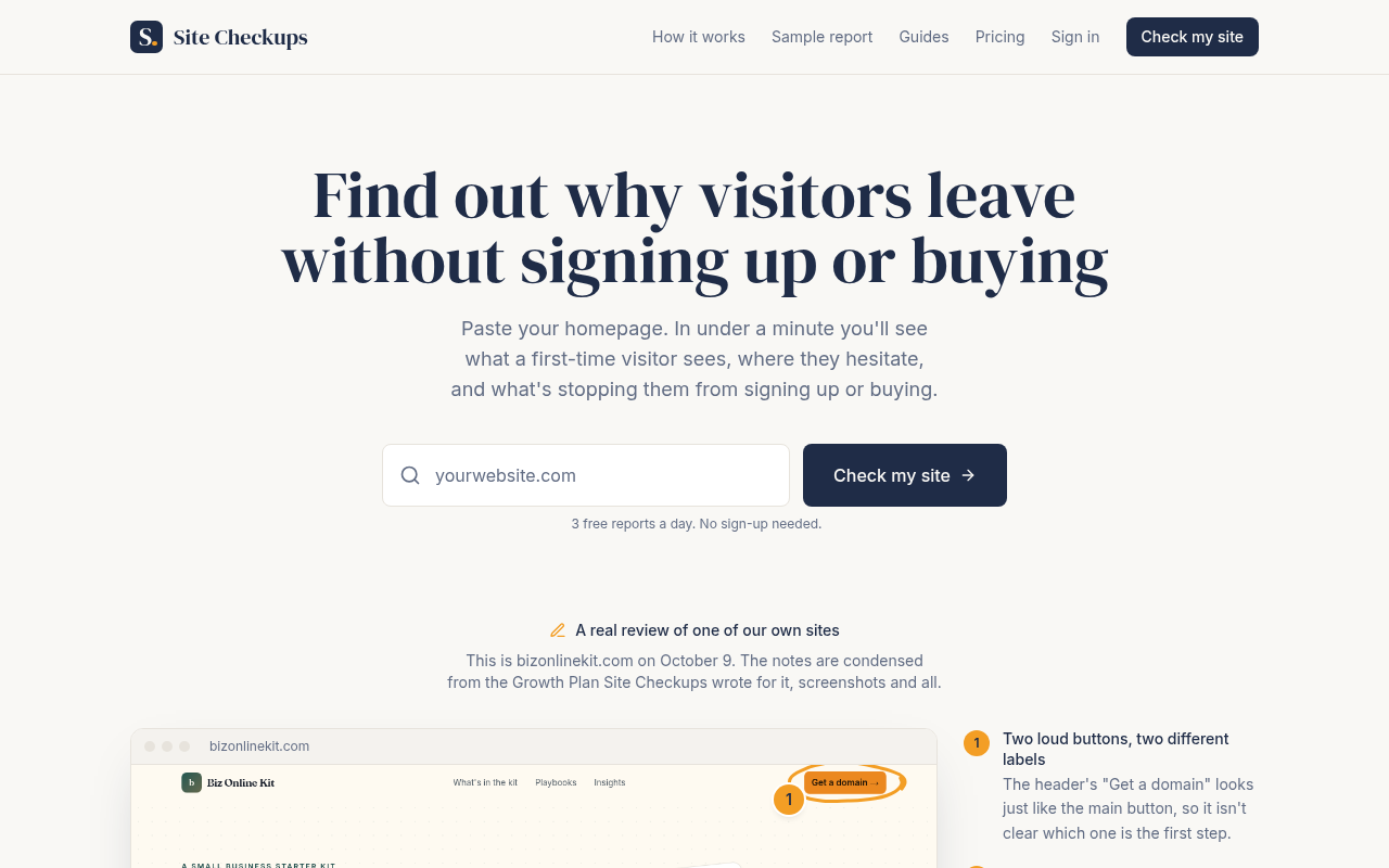
sitecheckups.com on a desktop screen, as it first loads
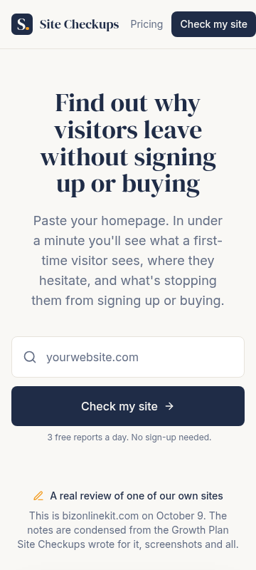
sitecheckups.com on a phone, as it first loads

On a desktop

It works. The serif headline "Find out why visitors leave without signing up or buying" grabs the eye first, the URL box and dark "Check my site" button sit centered well above the fold, and "3 free reports a day. No sign-up needed." removes the main excuse not to try. The bizonlinekit.com sample starts peeking in at the bottom with its first numbered note, which is a good tease. The one weak spot is the gap between the form and the sample. About 90px of empty cream pushes the proof down so only its top edge shows.

On a phone

Also solid. Headline, subhead, URL field and a full-width "Check my site" button all fit on the first screen, and the button is easy to hit with a thumb. The header carries a second "Check my site" button plus "Pricing", so the action is repeated, which is fine since it's the same action. Below the fold line you only get the caption "A real review of one of our own sites" with no screenshot or grade, so a phone visitor sees no proof before scrolling.

  1. 1

    Gap between the hero form and the sample review, desktop

    Roughly 90px of blank space under "3 free reports a day" pushes the bizonlinekit.com screenshot down so only its browser bar and the first note show. The F-to-A result, the strongest thing on the page, is nowhere near the first screen.

    Fix: Cut the top padding of the sample section by about half and move the line "October 9: F, 12 points from 4 blockers / November 12: A, no blockers" up so it sits right under the caption "A real review of one of our own sites", before the screenshot.

  2. 2

    Sample section caption on phone

    On the phone the first screen ends with two lines of small gray caption text and no image or grade. It reads as fine print, not proof.

    Fix: On mobile, put the before/after grade pill (F to A) directly under "A real review of one of our own sites" and shorten the gray caption to one line.

  3. 3

    Sample review side notes, desktop

    The numbered note "Two loud buttons, two different labels" sits in small type at the far right edge and gets cut off, so the left-side screenshot dominates and the explanation that makes it meaningful is easy to skip.

    Fix: Make the note titles a step larger and keep at least the first two notes visible beside the screenshot on load by reducing the space above the section.

Hero options· 3

Three ways to write the top of the page

  • The outcome

    Find out why visitors leave without signing up or buying

    Paste your homepage. In under a minute you'll see what a first-time visitor sees, where they hesitate, and what's stopping them. Free, no sign-up.

    Check my site

    Keep this one as the default, since it already passes the five-second test and only needs the CTA flow below fixed.

  • The low-traffic problem

    Too few visitors to test? Find what's wrong this week

    Under 5,000 visitors a month, an A/B test can take a year. Paste your homepage and get a plain-English read on what a stranger misses, free in under a minute.

    Check my site free

    Use it when your traffic comes from your low-traffic guide or from small-site communities where 'A/B test it' is advice people can't act on.

  • Proof on real pages

    From an F to an A in a month, on a real site

    We ran Site Checkups on bizonlinekit.com, worked through the plan, and the re-check came back with no blockers. Paste your homepage and see your own grade, free.

    Get my grade

    Pick this once you've got a second before-and-after, ideally from one of the five free-plan businesses, so the proof isn't only from your own sites.

Button and link text· 5

What each button should say

  • Hero form button

    Check my siteCheck my site free

  • Growth Plan section, under the $19 price

    See pricingGet the fixes for $19

  • Free-for-five block, after the $19 offer

    Ask for a free plan · 5 of 5 leftSmall business with no budget? Email us for one of 5 free plans

  • Under the bizonlinekit.com review

    See the before and after, and the full report and Growth PlanSee the full report and the plan that took it from F to A

  • Closing section form button

    Check my siteSee my site's grade

The checklist

What to do this week, and what comes next

This week

  • Rewrite the free-plan block so it doesn't undercut a ready buyer. Replace the copy with: "Five free plans for small businesses, in exchange for a sentence about what changed. Want yours now? It's $19 with a full refund within 48 hours, so there's no reason to wait."

    Low effort Medium impact

    Right now "Ask for a free plan" sits directly after the $19 ask, so someone ready to pay may email and wait instead. This keeps the offer but tells buyers which path is the fast one.

  • Add one line under the $19 price that spells out the split: "The free report tells you what's wrong. The $19 plan tells you what to change, with the exact words to paste and where to click in your site builder."

    Low effort Medium impact

    The FAQ calls the free report "the full diagnosis," so visitors wonder what's left to pay for. Spelling out fixes vs. findings at the price point answers that where the decision happens.

  • Add a short anonymous-friendly trust line to "Who's behind it": "Synergy Productions, Inc., a Washington company running small sites since 1998. You pay through Stripe, and every email to hello@sitecheckups.com gets a human reply." (Company name, state and Stripe come from your Terms page.)

    Low effort Low impact

    You won't show a name or face, and that's fine. A registered company, a known payment processor and a reply promise give a $19 buyer something concrete to trust instead.

Next

  • Add a "Works on any kind of site" strip right under the bizonlinekit.com card with three one-line findings from the outside sites you review, each labeled by type: "A bakery: the order button sat below three paragraphs about history." Use only real findings from real reports.

    Medium effort High impact

    Answers "will an AI understand my business" with evidence from shops and services, not just web tools.

  • Show a slice of the actual Growth Plan above "See pricing": the real "Before and after" button rename and the builder steps already on the page, framed as "This is what $19 gets you." Move it so it sits beside the price, not below the free-plan offer.

    Medium effort Medium impact

    Seeing the paste-ready output at the moment of paying makes the $19 feel concrete, and you already have the material.

  • Once a few outside sites have been reviewed, publish one teardown of a non-Synergy site (with permission) in the Teardowns section and link it from the hero area with "See a review of a real shop's homepage."

    High effort Medium impact

    A full public example on a stranger's site is the strongest proof you can earn without customers yet, and it doubles as content for your low traffic.

In your account you tick these off as you go, and your dashboard shows your progress and the next fix.

Then, a free re-check

Within 30 days of buying, run one free re-check. We read the page again and tell you what's fixed, what's still open and anything new, with the number of conversion blockers before and after. You can also copy the whole plan as text, save it as a PDF, and we email you a copy.