Teardown · synergyprod.com
Clever headline, quiet button: synergyprod.com
The review gave it an A: nothing on the page stops a buyer who fits. It also found a headline that takes a few seconds to decode, a button that hides what it does, and 25 years of clients with not one of them quoted.
By Synergy · Report run November 11, 2026
Synergy is our own design consultancy and the studio that makes Site Checkups. It has worked with clients for 25 years, on more than 500 projects. The homepage at synergyprod.com sells that experience to business and product owners and asks them to send an email. Few recent clients have found Synergy that way, and the page gets fewer than 500 visitors a month.
That's a common spot for an established consultancy: years of good work, and a homepage that has to win over strangers who never saw any of it. We gave Site Checkups the honest numbers, past clients included, and let it write the plan.
It scored an A, like Artisan PDF Studio, our other teardown. Nothing on the page stops a buyer who fits. What the review found is a page that proves less than the business behind it: one hard result, no client speaking in their own words, and a button that doesn't say what it does.
What to check on your own site
The report gave synergyprod.com an A (0 points from conversion blockers; how the grade works). These are the findings most homepages share.
- 1
Say what the button does
"Start a Conversation" opens an email. The page explains that, nicely, at the very bottom. A visitor deciding whether to click wants to know what happens next: a form, a call to book, or an email. One small line under the button answers it where the decision is made.
- 2
Let past clients do the talking
Twenty-five years of clients, and none of them speaks on the page. The logos show who Synergy worked for, but they can't say whether it went well, and only one of the three case studies has a result in numbers. The plan's top fix is the cheapest one any established business has: ask a handful of past clients for two sentences on what was stuck and what changed, and put their names next to them.
- 3
Say how big you are, early
The page says "we" and shows Fortune 500 logos, then explains further down that Synergy is one designer who brings in contractors. Nothing there is untrue, but a reader who pictured an agency feels the ground shift, and a bigger team starts to wonder whether one person is enough. Say it near the top and make it the reason to hire: you work with the senior person the whole time.
The report, as it came out
Everything above "Growth Plan" is in the free report. Nothing below is edited. A line in [brackets] is the plan asking the owner for something it couldn't find on the site. The AI wrote the report; the lessons above are where a person read it and decided what mattered, which is how Site Checkups is meant to be used (you're the judge).
Nothing on this page stops people from buying, but 8 things make people hesitate. The grade counts blockers only.
Fix these first
- 1
Trust gap
There are no client testimonials or named people vouching for the work. Logos and case studies carry the proof alone, so buyers can't hear from anyone who hired Synergy directly.
- 2
Button problem
"Start a Conversation" and "Get in Touch" don't say they open an email. The closing paragraph explains it well, but a visitor clicking from the hero gets no preview of the email-only process until they reach the bottom of the page.
- 3
Hesitation
"Is one person enough for our project, and what happens if he's unavailable?" Larger teams will weigh that risk before emailing.
Conversion blockers
What stops people from signing up or buying. The grade comes from these, weighted from 1 (minor) to 5 (critical).
None found. Nothing on this page should stop someone who came to buy.
How your page reads
To a first-time visitor
The headline is clever but abstract, so the first few seconds go to decoding a metaphor rather than learning what's sold. The subhead rescues it quickly: a senior UX/UI consultancy for teams that feel stuck. The client logos and the 25+ years line make it feel credible early, which is enough to keep the right buyer reading.
In the first five seconds
A senior UX and UI design consultancy offering an outside perspective to established teams, with big-name clients like Microsoft and T-Mobile.
What visitors think you offer
A small consultancy that audits and redesigns digital products for companies whose relaunches haven't moved the numbers.
What you actually offer
A one-person senior UX/UI practice (Brent Spore, plus contractors as needed) offering UX strategy, UI design, product discovery and design systems, quoted per project, with a side portfolio of 24 self-built tools.
Where the page and the offer don't match
- "Fortune 500 Clients" and "we" language set up an agency picture, then the page says Synergy is one designer. Visitors who expected a team may feel the scale was oversold, even though the page is upfront about it.
- Two of the three case studies were done as part of another firm's team or as six years in-house. Readers scanning the outcomes may credit Synergy with more independent agency work than it did, and the careful ones may notice and discount it.
Visitor hesitations
The doubts running through someone's head right before they leave.
- "Is one person enough for our project, and what happens if he's unavailable?" Larger teams will weigh that risk before emailing.
- "What does this roughly cost?" There's no ballpark or typical engagement size, which is normal for consulting but leaves smaller teams unsure if they can afford it.
- "Why is a design consultancy selling mesh gradient generators and browser toys?" The 24 side products can read as a hobby portfolio and dilute the senior-consultant positioning for some buyers.
Trust gaps
Proof a careful visitor looks for and doesn't find.
- There are no client testimonials or named people vouching for the work. Logos and case studies carry the proof alone, so buyers can't hear from anyone who hired Synergy directly.
Principle: Social Proof → - Only the T-Mobile case has a hard number. The other two results describe deliverables (an overhaul, a design system) rather than outcomes, which weakens the claim of fixing what's stuck.
Principle: Social Proof →
Button problems
Buttons and links that are unclear, compete with each other, or ask too much too soon.
- "Start a Conversation" and "Get in Touch" don't say they open an email. The closing paragraph explains it well, but a visitor clicking from the hero gets no preview of the email-only process until they reach the bottom of the page.
Growth Plan
The paid part: $19, one-time, for one site. Shown here in full. Before it's written you answer five quick questions, so the plan fits your business. Here's what we answered:
- Goal: get in touch or ask for a quote
- Visitors a month: under 500
- Customers so far: over 200
- For: Business Owners & Product Owners
Facts also taken from the site's own pages: /work
Start here: Get two or three past clients talking on the page
- 1Email five people from past engagements (T-Mobile/Garrigan Lyman, OnlifeHealth, Allied Telesis, plus a couple of smaller clients) and ask one question: "What was stuck before we worked together, and what changed after?" Ask if you can use their name, title and company.
- 2Pick the two or three answers that name a specific problem and a specific change. Skip the ones that only say "great to work with."
- 3Put one quote directly under the matching case study (e.g. under "The result" for OnlifeHealth), and one short quote right under the client logos in "Teams we've worked with."
- 4Ask one of them to speak to working with a solo senior designer, something like what it was like having Brent do the work himself. That answers the "is one person enough?" worry head on.
- 5If anyone gives you a number (adoption, support tickets, time to ship), add it to that case study's result line. Otherwise leave the result as it is.
You've done 500+ projects and have 200+ customers, but nobody on the page vouches for you. For a quote-based sale to business and product owners, hearing from someone who hired you is what turns "interesting" into an email. It also quietly fixes the two soft spots in the case studies: the OnlifeHealth and Allied Telesis results describe deliverables, not outcomes.
Quick wins: change these words
Hero, under the "Start a Conversation" button
NowNo text under the button
Change toOpens an email to hello@synergyprod.com. Brent replies personally with a plain read on whether he can help.
The bottom section explains the email-only process well, but people clicking from the hero don't know what happens next. A surprise mail client launching makes some visitors bail.
Hero button
NowStart a Conversation
Change toEmail Brent about your project
It says what the click does and who answers, and it reinforces the senior, no-layers point before anyone reads the About section.
Stats strip
NowFortune 500 Clients
Change toMicrosoft, T-Mobile, Symantec
A label invites doubt, especially once readers learn Synergy is one designer. Real names you already show in the logo row are harder to argue with.
Allied Telesis case study, The result
NowOne design system in place of a pile of one-off pages.
Change toOne design system in place of a pile of one-off pages. [Add one measurable change: search traffic, datasheet downloads, sales team usage, or page build time]
The diagnosis flagged that only T-Mobile has a number. You set up the problem as visitors leaving and sales ignoring the site, so close it with what changed for them.
"How we work" step 01
NowYou tell us what you're working on and what's in the way. We talk it through until we both know what the work is.
Change toYou tell us what you're working on and what's in the way. We talk it through until we both know what the work is. This part costs you nothing.
For a quote-based buyer, the real cost worry at this stage is whether the first talk is billed. Answering that removes a hesitation without putting a number on the page.
Who we are section
NowWhen a project needs more hands, he brings in contractors, so the team is as big as the work needs.
Change toWhen a project needs more hands, he brings in senior contractors he's worked with before, so the team is as big as the work needs and Brent stays your point of contact throughout.
Answers the "is one person enough" worry directly. Product owners at larger companies want to know who's accountable.
Products we run ourselves, intro
NowAlongside client work, Synergy builds and runs its own tools, apps and games, end to end. It's where we test what we recommend.
Change toAlongside client work, Synergy builds and runs its own products, end to end. Every design call we make for clients gets tested here first, on real users and real numbers.
Dropping "games" from the lead line and stressing testing keeps the side projects reading as proof of craft rather than a hobby list.
What visitors see first
On a desktop
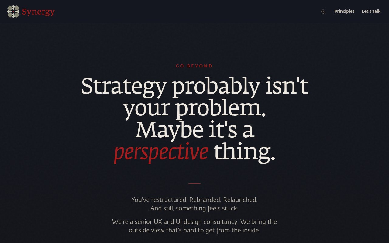
The four-line serif headline owns the screen, and the red italic "perspective" is the first thing the eye lands on. The subhead explaining what Synergy is sits at the very bottom edge, and the "Start a Conversation" button is below the fold at 1280x800. So a desktop visitor sees a riddle, a small explanation, and no button unless they scroll or spot "Let's talk" in the nav. The 25+ Years / 500+ Projects / Fortune 500 stats and client logos, the strongest early proof, are also out of view.
On a phone
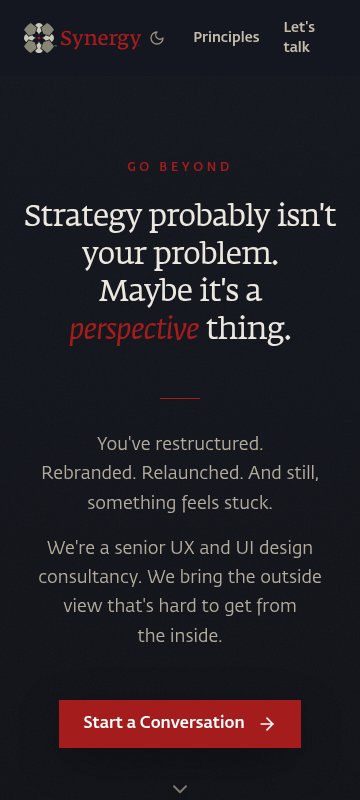
Mobile does better than desktop. The headline is tighter, the subhead fits, and the red "Start a Conversation" button is visible without scrolling. The weak spot is the nav, where "Let's talk" wraps onto two lines and looks cramped next to the moon icon. As on desktop, no proof (stats, logos) shows before the scroll.
Desktop hero
The headline at roughly 80px across four lines plus large top padding pushes the CTA button off the first screen on a standard laptop.
Fix: Cut the space above "GO BEYOND" by about half and drop the headline size so it breaks into three lines. That should pull "Start a Conversation" above 800px.
Desktop and mobile hero
The proof stats (25+ Years, 500+ Projects, Fortune 500 Clients) sit below the button, so first-screen visitors get a clever line and no reason to trust it.
Fix: Put a single small line of the stats or the five client logos directly under the button, in the same muted gray as the subhead.
Mobile header
"Let's talk" wraps to two lines and crowds the moon toggle, so the main contact link looks broken.
Fix: Set the nav link to no-wrap and shrink the gap between items, or hide the theme toggle on screens under 400px.
Hero subhead text
The gray body copy on the near-black background is low-contrast, and it carries the sentence that actually explains the offer.
Fix: Lighten the subhead color toward the headline's off-white, at least for the line "We're a senior UX and UI design consultancy."
Three ways to write the hero
The stuck team
You've relaunched. The numbers didn't move.
Synergy is a senior UX and UI consultancy. We find what your team has stopped seeing, then fix it, from strategy through design systems. 25+ years, Fortune 500 to startups.
Email us what's stuckUse it when: Use this if most of your leads are product owners who've already tried a redesign and are frustrated it didn't work.
Proof first
We flipped T-Mobile's purchase path. Sales rose 33.7%.
Senior UX and UI design for teams whose product is hard to use and they can't see why. One experienced lead, no juniors, contractors added only when the work needs them.
Tell us about your productUse it when: Pick this when you want skeptical, larger buyers to see a hard result before they read anything else.
Senior, direct access
A senior UX designer on your problem. No layers, no juniors.
Synergy is Brent Spore and 25 years of product work for companies like T-Mobile and Microsoft. You talk to the person doing the work, and you agree a quote before anything starts.
Email Brent directlyUse it when: Use this if you'd rather own the one-person setup up front, so business owners see it as a strength and nobody feels the scale was oversold later.
Button and link text
Hero button
Start a ConversationEmail us what's stuck
Final section button
Get in TouchEmail hello@synergyprod.com
Small line directly under the hero button (new)
(none)Opens an email. No form, no call to book. We reply with a plain read on whether we can help.
Products section link
See all 24 productsSee the tools we build and run
The checklist
This week
Make the hero button say what happens. Change "Start a Conversation" to open a pre-filled email, and add one line under it: "Opens an email to Brent. Send a paragraph about what's stuck. You'll get a plain reply on whether I can help."
Effort: low · Impact: high
The best explanation of your process is buried in the last paragraph. People clicking from the top don't know they're about to get a mail client, and that surprise loses some of them.
Tighten the result lines for OnlifeHealth and Allied Telesis. Replace "One design system in place of a pile of one-off pages" with what that let the team do afterward, e.g. "[how fast new pages shipped after the system was in place]" and "the sales team started using the site for [what]." Fill the brackets only with things you actually know.
Effort: low · Impact: med
T-Mobile's 17% and 33.7% do the heavy lifting alone. Owners hiring you to fix what's stuck want outcomes, not deliverables.
Add a line to "No surprises" under "A conversation": "The first conversation costs nothing. You'll know whether I'm the right fit before we talk about a quote." Under "An agreed quote" add: "The quote is based on the scope we agreed, not hours you can't predict."
Effort: low · Impact: med
The "what will this cost?" worry is answered best by showing how a price is reached and that the first step is free. No figures needed.
Next
Reframe the scale question openly. In "Who we are" add: "For bigger projects I bring in contractors I've worked with for years. You still deal with me, and I review every piece of work." Name roles you actually bring in, e.g. [researcher, front-end developer].
Effort: low · Impact: med
The hero and stats read like an agency, then the page reveals one person. Saying plainly how scale works turns a doubt into a selling point (no juniors, no layers).
Shrink "Products we run ourselves" to one line and a link, and move it below "A fresh perspective changes what you see" or into the footer. Keep Site Checkups visible since it's closest to the consulting work.
Effort: low · Impact: med
Browser toys and games next to Fortune 500 case studies dilute the senior-consultant read for buyers deciding whether to email.
Clarify the context on the two non-independent projects: keep "as part of the Garrigan Lyman Group team" and "Six years leading UX and UI design in-house" but lead each with your role, e.g. "Brent led UX research and the purchase-path redesign."
Effort: low · Impact: low
Careful readers notice the context. Owning your specific role up front reads as honest and senior, and stops them discounting the work.
In your account you tick these off as you go, and your dashboard shows your progress and the next fix.
FAQ answers for the page
Is one person enough for our project?
Brent leads every project and brings in contractors when the scope needs more hands, so the team grows with the work. You still deal with the senior person, not a handoff. [Add what happens if Brent is unavailable mid-project.]
What does a project roughly cost?
Every project is quoted after a conversation about what you need. You agree the price before any work starts, and the contract only writes down what we already agreed.
How do we start?
Email hello@synergyprod.com with a paragraph about what you're working on and what's in the way. We reply with whether we can help and what a sensible first step looks like. No form and no call to book first.
Do you only work with large companies?
No. Clients range from Fortune 500 companies like T-Mobile and Microsoft to startups. The process is the same: a conversation, an agreed quote, then a contract.
Why does a design consultancy build its own apps and games?
They're where we test what we recommend. Running 24 products end to end means we deal with real users, real friction and real numbers, not just client briefs.
How it shows up in search and shared links
synergyprod.com
Synergy | Senior UX and UI Design Consultancy
Relaunched and nothing moved? Senior UX and UI design for teams that are stuck. 25+ years, T-Mobile to startups. Email us what's in the way.
Making these changes in your site builder
- 1
Replace the hero headline and subheadline
Open the homepage in your editor, click the H1 text 'Strategy probably isn't your problem...', paste your chosen headline, then click the paragraph under it and paste the new subheadline. Check that the heading stays styled as H1. Save and publish.
- 2
Change the hero button text
Click the 'Start a Conversation' button, open its settings (usually a gear or 'Edit button'), change the label to 'Email us what's stuck' and confirm the link is mailto:hello@synergyprod.com.
- 3
Add the reassurance line under the hero button
Add a small text block directly below the button (look for 'Add element' or '+' then 'Text'). Paste the line about it opening an email with no form. Set it to a small, muted font size.
- 4
Update the closing button
Scroll to 'A fresh perspective changes what you see', click 'Get in Touch', change the label to 'Email hello@synergyprod.com' and keep the mailto link.
- 5
Add an FAQ section
Insert a new section between 'No surprises.' and 'Products we run ourselves.' Use an FAQ or accordion block if your builder has one, otherwise a heading plus text blocks. Paste the five questions and answers, and fill in the bracketed placeholder before publishing.
- 6
Update the page title and meta description
Open page settings for the homepage (often 'SEO' or 'Search and social'). Paste the new title and description, save, then republish the site.
Tests worth running
- You're under 500 visitors a month, far too few for A/B tests, so use quick checks instead.
- Five-second test: show the hero to five business or product owners for five seconds and ask what you sell and who it's for. If more than one stumbles on "inside the jar," the new hero needs to lead with the plain line.
- Call three past clients for 15 minutes and ask what nearly stopped them from reaching out and what made them say yes. Use their words in the hero and the "No surprises" section.
- Watch your inbox for a month after the button change: count emails and note how many mention the price or team-size worry. That's your real signal at this traffic level.
Then, a free re-check
Within 30 days of buying, run one free re-check. We read the page again and tell you what's fixed, what's still open and anything new, with the number of conversion blockers before and after. You can also copy the whole plan as text, save it as a PDF, and we email you a copy.
Want a second pair of eyes?
Paste your homepage and see what a stranger sees. Free, in under a minute.