Teardown · superchargedemail.com
A stranger's name at checkout: superchargedemail.com
The review gave it a C. Both blockers sit at the moment of signing up: a partner company the visitor has never heard of, and nothing to show anyone has used the tools. One finding is wrong, and the mistake is ours. We made the changes, and the fresh report gave it a B.
By Synergy · Report run November 11, 2026
Supercharged Email is one of our own sites. It offers 23 free tools, templates and playbooks for small businesses that send their email through Constant Contact: write the email, plan the week, grow the list. Nothing on it costs money. When a visitor starts a Constant Contact trial through its link, we earn a referral commission, and the page says so.
That makes it a different page from our other teardowns. There's no product of our own to sell. The one action that matters is a sign-up on someone else's site, under a partner account with a name the visitor has never seen. It gets fewer than 500 visitors a month and has between 20 and 200 customers so far. We gave Site Checkups those numbers and let it write the plan.
It got a C, our first teardown that isn't an A. Both blockers are about trust at the moment of signing up: an unexplained company name where the visitor hands over their email list, and no sign that anyone has used the tools.
One finding is wrong, and the mistake is ours. The report says the footer's commission note "ends mid-sentence". It doesn't. The footer is longer than the 1,000 characters our reader passed to the AI, the cut fell mid-sentence, and the AI took our cut for the site's typo. The plan repeats it twice. We left the report as it came out, because catching this is exactly the reader's job, and we've changed the reader so the AI now gets the whole footer and is told when one has been cut.
What to check on your own site
The report gave superchargedemail.com a C (6 points from conversion blockers; how the grade works). These are the findings most homepages share.
- 1
Explain the name they'll meet at checkout
Every "Start free" button opens Constant Contact's trial under a partner account called Synergy. A visitor who trusted "Supercharged Email" suddenly meets a company they've never heard of, at the step where they hand over their contact list. The FAQ names the partner but never says whose account it is or who bills you. If your checkout, booking or payment step shows another company's name, say so next to the button in one line: whose account it is, who bills you, and what it costs.
- 2
Mark sample numbers as samples
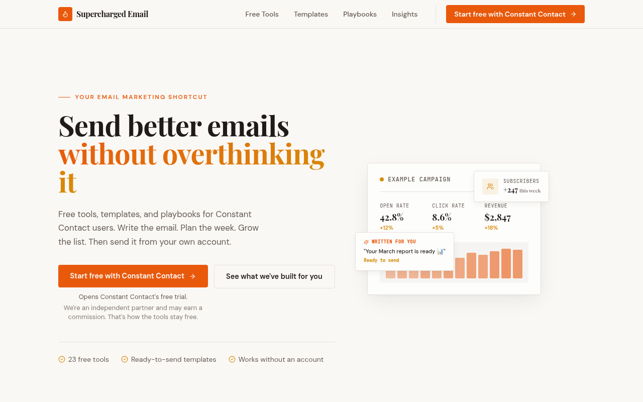
The card beside the headline shows a 42.8% open rate, $2,847 in revenue and 247 new subscribers, under a small "Example campaign" label. They're illustrations, but at a glance they read as results the tools produced. On a page with no other proof, an invented number becomes the loudest claim on it. Label it plainly, or show something real the tool made instead.
- 3
Ask the reader your button is for
The headline and description speak to people who already use Constant Contact. The button, five times over, asks them to start a free trial of it. People who have an account have no reason to click, and people who don't were never addressed. Check that your main button asks for something the person your headline names would want, and ask once or twice, not five times.
What we did with it
A plan is advice, and the owner decides. Here's what we changed, what we didn't and why, and what a fresh report said afterwards. Before: a C (6 points, 2 blockers). After: a B (3 points, 1 blocker).
What we changed
Explained the name at checkout
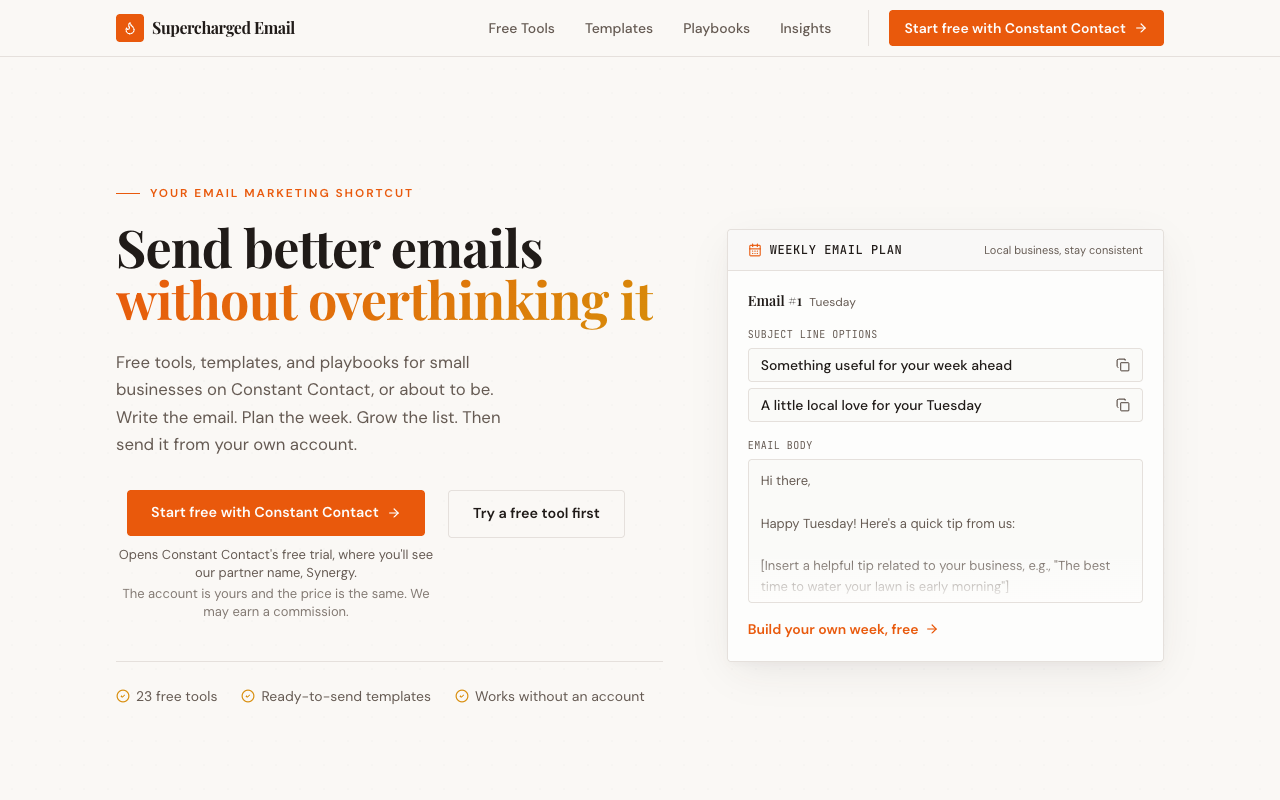
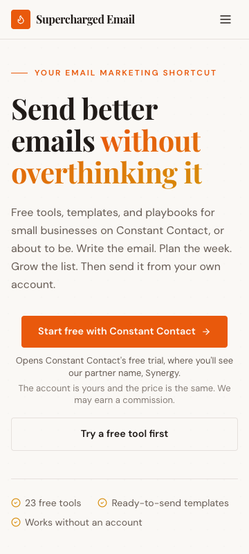
Under the main button: "Opens Constant Contact's free trial, where you'll see our partner name, Synergy. The account is yours and the price is the same. We may earn a commission." The FAQ now says Synergy is the company that runs the site, that its partner code only tells Constant Contact who sent you, and that Constant Contact bills you and handles your support. That answers the plan's [Confirm] brackets: the answer was Constant Contact's, not ours.
From the plan: "Turn the Synergy moment from a scare into a reason to trust the signup"
Swapped the sample dashboard for real output
We labeled the dashboard first, then took the plan's other option. The hero now shows the first email the Weekly email plan gives a local business, word for word.
From the plan: "Or swap it for a real output from the Weekly email plan tool, like a generated subject line and opening paragraph."
Five trial buttons down to three
The navigation, the hero and the closing box. The plan said two; we kept the one in the navigation. The middle one now links to the Weekly email plan, and the commission note sits under the hero button instead of under every button.
From the plan: "Cut the 'Start free with Constant Contact' button from five appearances to two"
Spoke to people about to join
The hero says the tools are for small businesses "on Constant Contact, or about to be", so the trial button has someone to talk to. The page title and description say the same.
From the plan: "Fix the audience mismatch in the hero subhead and meta description."
Named the commission
"What's the catch? There isn't one." now begins: "Constant Contact pays us a commission when you sign up through our link."
From the plan: "'There isn't one' sounds like a sales line."
Asked at the moment the tool delivers
After someone copies part of their weekly plan, one line appears under it: "Copied. Not on Constant Contact yet? Start the free trial and send this one today." Once a visit, no popup.
From the plan: "Put a soft trial prompt inside the most popular tool."
Smaller fixes
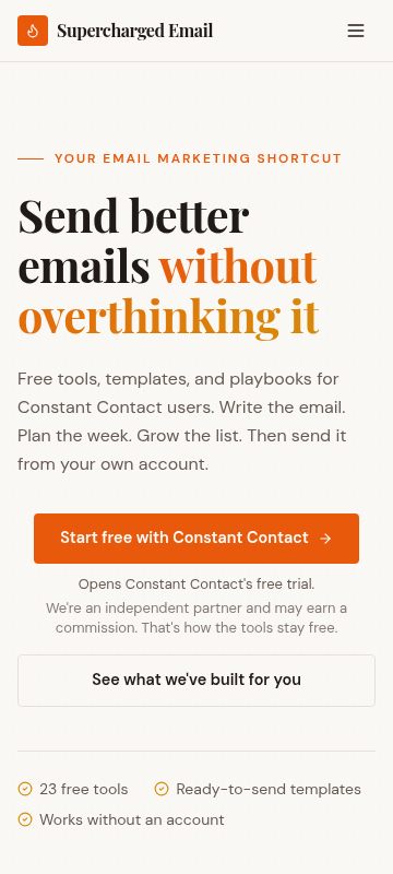
The missing section 04, the word "it" alone on the headline's third line, the empty space above the hero on phones, and "Explore" on the Weekly plan card, which now says "Plan my week, free".
From the plan: "Also fix the missing '04' in the section numbering"
What we didn't change, and why
The plan's words first, then the reason they were wrong for this business.
"Turn your 20 to 200 sign-ups into proof. Email them three questions: which tool they used, what they sent, and what happened."
We can't. Supercharged Email never learns who signs up: the account, the email address and the billing all sit with Constant Contact, and we get a commission report. We told Site Checkups we had 20 to 200 customers, and it reasonably assumed we could reach them. It should have asked whether the sale happens on our site or someone else's, and its questions don't cover that yet. Proof for a site like this has to come from what the site itself does, which is why the hero now shows a real email from the tools.
"Change the image alt text from 'Synergy' to something that describes the image"
The image is Synergy's logo, after the words "Made by" in the footer, so "Synergy" already describes it. The plan's quick-win version, "Supercharged Email logo", would have told screen readers the wrong thing. The real problem was that nothing explained who Synergy is, and the FAQ now does.
"Fix the footer disclosure that stops mid-sentence at 'when you sign up through'."
It never stopped. That was our reader's cut, explained at the top of this page.
"Start my free Constant Contact trial"
The button says the same thing in the navigation and on all 23 tool pages. We left its words alone and let the new note under it do the explaining, so if trial clicks move, we'll know which change moved them.
What happened
We ran a fresh report the same evening. The Synergy blocker is gone, and so is the footer finding, now that our reader passes the whole footer. One blocker is left, and it's the one we expected: "There's no proof anywhere: no user counts, no testimonials from small businesses, no named founder or team, no results from emails sent with these tools." The owner stays anonymous and the buyers belong to Constant Contact, so the proof will have to be a count of plans built with the tools, once there's a month of it.
The new report also caught one of our own changes. The sample email in the hero "is mostly brackets", which undercuts the page's "done before you start". That's fair. Every email the tool writes leaves a blank or two for the owner's own news, so no other example would have fixed it. The hero now shows the parts that come finished: the week's strategy, the subject lines and the preview text. The "after" screenshots above are the version the report graded.
This teardown also changed Site Checkups. The Growth Plan now asks where the sale happens: on your site, or on a partner's site through your link. We rewrote this plan with "on a partner's site" and the same other answers. It no longer asks us to email our sign-ups or to confirm who handles billing. Instead it says: "You can't show buyer testimonials because Constant Contact owns those customers. Your own tools' usage is proof you do own." Its two brackets now ask for things only we know: how many plans have been built, and a line about Synergy. It still suggests changing the "Synergy" alt text. The page had changed by then too, so not every difference comes from the new question, but these do: the plan says so.
Trial clicks: too soon to tell. Each button now reports on its own, and we'll add the numbers here after four weeks.
The report, as it came out
Everything above "Growth Plan" is in the free report. Nothing below is edited. A line in [brackets] is the plan asking the owner for something it couldn't find on the site. The AI wrote the report; the lessons above are where a person read it and decided what mattered, which is how Site Checkups is meant to be used (you're the judge).
2 blockers can stop people from buying, and 13 things make people hesitate. The grade weighs each blocker by how serious it is.
Fix these first
- 1
Blocker, 3/5
The page's main action is starting a Constant Contact trial through a partner account named Synergy, a different name from the brand the visitor trusted. The page never explains what that partner relationship means for account ownership, data or support.
- 2
Blocker, 3/5
Nothing shows that real people use or benefit from these tools. There are no user counts, testimonials, named customers or sample outputs, only a mock dashboard.
- 3
Trust gap
No named person or company behind Supercharged Email appears anywhere. 'We do the thinking for you' comes from a faceless brand, which makes the commission disclosure feel more like a warning than honesty.
Conversion blockers
What stops people from signing up or buying. The grade comes from these, weighted from 1 (minor) to 5 (critical).
The page's main action is starting a Constant Contact trial through a partner account named Synergy, a different name from the brand the visitor trusted. The page never explains what that partner relationship means for account ownership, data or support. 3/5
Signing up for a paid tool that will hold a customer list is a high-trust step. Seeing an unfamiliar company name at checkout, with only a vague FAQ answer, makes many visitors back out or go to Constant Contact directly, which costs the commission.
Nothing shows that real people use or benefit from these tools. There are no user counts, testimonials, named customers or sample outputs, only a mock dashboard. 3/5
Visitors are asked to trust an unknown affiliate with where they set up their email account. Without any sign that others have done this, the free claims carry little weight.
Principle: Social Proof →How your page reads
To a first-time visitor
Visitors see a friendly promise of free email tools and templates, then notice every main button sends them to Constant Contact's free trial. Existing Constant Contact users may wonder why they're being pushed to sign up again, and people who just want a free tool may feel the page is really an affiliate funnel dressed as a toolkit.
In the first five seconds
Free email tools and templates for Constant Contact users, plus a lot of buttons that start a Constant Contact trial.
What visitors think you offer
A free library of email-writing tools for Constant Contact users, or possibly a reseller trying to get people onto Constant Contact.
What you actually offer
An affiliate site for Constant Contact. Its 23 free tools, templates and playbooks work without an account, and the business earns a commission when visitors start a Constant Contact trial through its partner account (Synergy).
Where the page and the offer don't match
- The headline and meta description speak to people who already use Constant Contact, but every repeated CTA is 'Start free with Constant Contact.' Existing customers, the stated audience, have no reason to click it, and the button reads as aimed at someone else.
- The page says 'No signup' and 'Works without an account' for the tools, yet the sign-up CTA is the one repeated five times. Visitors who came for a free tool can read the toolkit as bait for the trial link.
Principle: Mental Model → - The 'Example campaign' card shows a 42.8% open rate, $2,847 revenue and +247 subscribers. Visitors can easily read these as results from using the tools rather than an illustrative mockup, then feel misled when they work out it's sample data.
Visitor hesitations
The doubts running through someone's head right before they leave.
- 'Why will it say Synergy when I sign up? Am I handing my account to some third party?' The FAQ raises this but only says it's a partner account. It doesn't spell out who controls billing, data or support.
- 'I already have Constant Contact. Is anything here for me, or is this all a sign-up pitch?'
- 'Are these tools actually good, or thin AI generators?' Nothing on the page shows a real output from any of the 23 tools.
- The image alt text reads only 'Synergy,' and the footer links to two sister sites. Visitors may sense a network of affiliate sites, which makes the free tools feel less independent.
Trust gaps
Proof a careful visitor looks for and doesn't find.
- No named person or company behind Supercharged Email appears anywhere. 'We do the thinking for you' comes from a faceless brand, which makes the commission disclosure feel more like a warning than honesty.
- The footer disclosure ends mid-sentence ('We may receive a commission when you sign up through'). That reads as sloppy at exactly the point visitors are checking for honesty.
Principle: Aesthetic-Usability Effect → - 'What's the catch? There isn't one' is a bold answer with nothing behind it, such as a link to Constant Contact's partner program or pricing.
Button problems
Buttons and links that are unclear, compete with each other, or ask too much too soon.
- 'Start free with Constant Contact' appears five times with an identical commission disclaimer each time. The repetition makes the page feel like it's pushing hard, and it gives the stated audience (existing users) nothing to click.
- The free tools, which are the real draw, sit behind 'See what we've built for you' and many 'Explore' links. The text doesn't make clear which of the two hero actions the page wants first, so visitors split between trying a tool and starting a trial.
Principle: Hick's Law → - The heading '04' is skipped in the numbered sections (03 Playbooks jumps to 05 How It Works). Attentive visitors may assume something failed to load.
Growth Plan
The paid part: $19, one-time, for one site. Shown here in full. Before it's written you answer five quick questions, so the plan fits your business. Here's what we answered:
- Goal: sign up or start a trial
- Visitors a month: under 500
- Customers so far: 20 to 200
- For: small business owners
- Avoid: anything that needs a name or a face (we stay anonymous)
Facts also taken from the site's own pages: /tools/weekly-email-plan, /playbooks/increase-open-rates
Start here: Turn the Synergy moment from a scare into a reason to trust the signup
- 1Rewrite the FAQ answer to 'Why does it say "Synergy" when I sign up?' so it covers the three things people actually worry about. Write it like this: 'Synergy is our parent company and a Constant Contact partner. Your account, your contact list and your billing are all with Constant Contact. You log in at constantcontact.com, you pay Constant Contact directly, and you can cancel the same way anyone else can. [Confirm: who handles support, Constant Contact or Synergy?]'
- 2Move that FAQ, or a one-line version of it, directly under the hero 'Start free with Constant Contact' button, in place of the current commission note. Something like: 'You'll see our partner name, Synergy, at signup. Your account and list stay 100% yours. Same price as going direct.'
- 3Fix the footer disclosure that stops mid-sentence at 'when you sign up through'. Finish it: 'We may receive a commission when you sign up through our links, at no extra cost to you.'
- 4Change the image alt text from 'Synergy' to something that describes the image, so screen readers and skimmers don't hit an unexplained brand name.
- 5Make 'What's the catch? There isn't one.' prove itself by adding one line: 'Constant Contact pays us a referral fee. You pay their standard price.' [Link to Constant Contact's public pricing page if you're allowed to.]
Your goal is trial signups, and the riskiest second on the whole funnel is when a visitor lands on a Constant Contact checkout that says Synergy. That's where a cautious small business owner bails or goes direct, and you lose the commission. You're staying anonymous, so you can't fix trust with a face. Clear policy on who owns the account, the list and the billing is the anonymous-friendly substitute, and it costs you an afternoon of copy edits.
Quick wins: change these words
Footer disclosure
NowWe may receive a commission when you sign up through
Change toWe may receive a commission when you sign up through our links, at no extra cost to you.
The sentence is cut off in the exact spot people check for honesty. Finishing it costs a minute and removes a sloppy signal right before signup.
FAQ, Synergy question
NowSupercharged Email works with Constant Contact through a partner account (Synergy). You still get full access to Constant Contact, this simply allows us to provide additional tools and resources.
Change toSynergy is the partner company Supercharged Email belongs to, and it's the account your signup is tracked under. Your Constant Contact account, contact list and billing are yours, and you log in at Constant Contact like anyone else. [Confirm: who handles billing and support, Constant Contact or Synergy?]
The diagnosis rated the Synergy surprise the top blocker. Saying plainly who owns the account and list answers the worry that stops people at checkout.
Hero subhead
NowFree tools, templates, and playbooks for Constant Contact users. Write the email. Plan the week. Grow the list. Then send it from your own account.
Change toFree tools, templates, and playbooks for small businesses on Constant Contact. Not on it yet? Start the free trial here and everything is ready on day one.
The current copy talks only to existing users, so the trial button has no reason to exist for them. One sentence gives new visitors, the people who can actually start a trial, a reason to click.
FAQ, 'What's the catch?'
NowThere isn't one. Constant Contact costs the same through our link. Our tools are free, and you run your own account.
Change toWe earn a commission from Constant Contact if you sign up through our link. You pay the same price you'd pay going direct, the tools stay free, and you own your account and list.
'There isn't one' sounds like a sales line. Naming the commission up front turns it into the honest answer and makes the trial click feel safe.
Image alt text
NowSynergy
Change toSupercharged Email logo
The stray 'Synergy' alt text feeds the suspicion of an affiliate network and is bad for screen readers. It's a 10-second fix.
Section numbering
Now03 Playbooks jumps to 05 How It Works
Change toRenumber: 04 How It Works, 05 Why Us, 06 FAQ
A missing 04 looks like something failed to load, a small crack in trust on a page asking people to sign up.
Tools section, 'Weekly email plan' card
NowMost Popular Weekly email plan Tell us what you do. Get a full week of emails to send. Explore
Change toChange the button from 'Explore' to 'Build my week free (no signup)'
This is your strongest free hook. A specific button gets people using a tool, and people who've seen real output are far likelier to start the trial afterward.
What visitors see first
On a desktop
The serif headline 'Send better emails without overthinking it' grabs the eye first, then the orange 'Start free with Constant Contact' button, which sits fully visible along with a duplicate in the nav. The offer is clear enough: free tools for Constant Contact users. Two things work against the trial goal. The two-line disclaimer under the button is the densest text in the fold and reads like fine print right where you want a click. And the dashboard mockup on the right shows '42.8%', '$2,847' and '+247 this week' with only a small 'EXAMPLE CAMPAIGN' label, so it reads like a results claim. The headline breaks with a lonely 'it' on its own line, which wastes vertical space.
On a phone
The headline, subhead and orange trial button all fit before the fold, and the button is full width and easy to tap. The mockup is gone on mobile, which actually helps because the fake stats disappear. But the disclaimer pushes 'See what we've built for you' and the three checkmarks to the bottom edge, and the gap between the eyebrow and the top bar burns about 80px. There's no line telling a visitor who isn't on Constant Contact yet why they should start the trial here.
Desktop hero, dashboard mockup
The stats are big and bold, and the 'EXAMPLE CAMPAIGN' label is tiny monospace. Visitors take the numbers as results, which is exactly the mismatch the diagnosis flagged.
Fix: Change the card label to 'Sample dashboard (illustrative)' at the same size as the stat labels, or swap the card for a real screenshot of a Weekly Email Plan output.
Desktop hero headline
'it' wraps onto a third line alone, pushing the CTA down and making the H1 look unbalanced.
Fix: Widen the headline container about 40px or drop the font size one step so it breaks as 'Send better emails / without overthinking it'.
Under the hero CTA (desktop and mobile)
Two lines of grey disclaimer sit between the primary and secondary buttons on mobile and look like a warning label under the button on desktop.
Fix: Cut it to one line under the button: 'Same price as going direct. We may earn a commission.' Move the full explanation to the FAQ.
Mobile hero top spacing
Roughly 80px of empty space above the 'YOUR EMAIL MARKETING SHORTCUT' eyebrow pushes the checkmark row almost off screen.
Fix: Halve the top padding of the hero section on mobile.
Three ways to write the hero
Outcome for newcomers
Your first Constant Contact emails, already written
23 free tools, templates and playbooks for small business owners. Get a week of emails planned, then start your Constant Contact free trial and send them from your own account.
Start my free Constant Contact trialUse it when: Use this if most of your visitors don't have Constant Contact yet, which matches your goal of trial sign-ups.
Problem: blank page
Stop staring at a blank email
Tell us what your business does and get a full week of emails with subject lines, body copy and buttons. Free, no signup. When you're ready to send, start a free Constant Contact trial.
Plan my week of emailsUse it when: Pick this if you want visitors to try the Weekly Email Plan first and meet the trial button once they've seen the tool works.
Honest, no catch
Free email tools. Same Constant Contact price.
Sign up for Constant Contact through us and you pay exactly what you'd pay going direct. You own the account. We earn a small commission, and that's what keeps every tool here free.
Start free with Constant ContactUse it when: Use this if visitors are dropping off at the Synergy partner screen and trust is the bigger problem than interest.
Button and link text
Hero, primary button
Start free with Constant ContactStart my free Constant Contact trial
Hero, secondary button
See what we've built for youTry a free tool first (no signup)
Hero, small print under the button
Opens Constant Contact's free trial. We're an independent partner and may earn a commission. That's how the tools stay free.Opens Constant Contact's free trial. You'll see our partner name, Synergy, at signup. You own the account and pay the same as going direct.
Tools section, Weekly email plan card
ExplorePlan my week
Compare section button
Start free with Constant ContactGet the same Constant Contact, plus free tools
Final 'Ready to send better emails?' button
Start free with Constant ContactStart my free trial and send this week
Footer disclosure (cut off mid-sentence)
We may receive a commission when you sign up throughWe may receive a commission when you sign up through our link. Your price is the same either way.
The checklist
This week
Label the 'Example campaign' dashboard (42.8% open rate, $2,847 revenue, +247 subscribers) as sample data. Add a small tag above it: 'Sample dashboard, for illustration.' Or swap it for a real output from the Weekly email plan tool, like a generated subject line and opening paragraph.
Effort: low · Impact: high
Right now it reads like a results claim. Anyone who works out it's fake will distrust the 'no catch' FAQ too. And it's dated Mar 2026, which looks stale in November. A real tool output proves the tools aren't thin, which the page currently never shows.
Cut the 'Start free with Constant Contact' button from five appearances to two (hero and the closing 'Ready to send better emails?' block). Drop the repeated commission paragraph under the middle three. Put the disclosure once in the hero and once in the footer.
Effort: low · Impact: med
Five identical buttons with five identical disclaimers makes the page feel like it's pushing. Two well-placed asks plus an honest disclosure convert better with a skeptical small business audience.
Fix the audience mismatch in the hero subhead and meta description. They say 'for Constant Contact users', but you want people to start a trial. Change the subhead to: 'Free tools, templates and playbooks for small businesses on Constant Contact, or about to be. Write the email, plan the week, grow the list.' Also fix the missing '04' in the section numbering (03 Playbooks jumps to 05 How It Works).
Effort: low · Impact: med
Existing users can't start a trial, so the page is currently speaking to people who can't do the thing you want. The new hero should welcome both groups and make it obvious the trial is for people not yet on Constant Contact.
Next
Turn your 20 to 200 sign-ups into proof. Email them three questions: which tool they used, what they sent, and what happened. Ask permission to quote them by first name and business type only (e.g. 'Dana, bakery owner'). Put the best two or three under the hero.
Effort: med · Impact: high
The diagnosis flagged zero social proof. You have real users, so this is the cheapest proof you'll ever get, and it doesn't require your own name or face.
Add a short 'What happens when you click Start free' strip near the closing CTA: 1) You land on Constant Contact's own trial page. 2) You'll see Synergy listed as the partner. 3) Your account, list and billing are with Constant Contact. 4) Every tool here stays free either way. [Add trial length and whether a card is required, from Constant Contact's terms.]
Effort: low · Impact: med
People who can't see the next step don't take it. Spelling out the handoff answers the 'am I handing my account to a third party' worry before it starts.
Put a soft trial prompt inside the most popular tool. After someone builds a plan in Weekly email plan, show: 'Your week of emails is ready. Don't have Constant Contact yet? Start free and paste these straight in.'
Effort: med · Impact: high
Someone holding a finished week of emails is far more ready to sign up than someone reading the homepage. The tool is your best salesperson, so ask at the moment it has just delivered.
In your account you tick these off as you go, and your dashboard shows your progress and the next fix.
FAQ answers for the page
Why does it say Synergy when I sign up?
Synergy is the partner account Supercharged Email uses with Constant Contact. You get full Constant Contact access in your own account. [Owner: confirm who handles billing and support, and that you can't see subscriber lists, then state it here plainly.]
Does it cost more to sign up through you?
No. Constant Contact costs the same through our link as going direct. We earn a commission from Constant Contact, not from you.
I already use Constant Contact. Is this useful to me?
Yes. All 23 tools work without an account or signup. Use the Weekly Email Plan or Subject Line Tester and paste the results straight into your existing account.
Are the numbers in the example campaign real results?
No, that card is a sample to show what a campaign report looks like. [Owner: add a real result or a user count here if you have one.]
What do the tools actually give me?
Finished copy you can paste. The Weekly Email Plan, for example, asks your business type and goal for the week, then gives you a week of emails with subject lines, body copy and buttons.
How it shows up in search and shared links
superchargedemail.com
Free Email Tools for Constant Contact | Supercharged Email
23 free tools, templates and playbooks for small businesses. Plan a week of emails in minutes, then send from your own Constant Contact account.
Making these changes in your site builder
- 1
Swap the hero headline and subheadline
Open the homepage in your editor, click the 'Send better emails without overthinking it' heading, paste your chosen headline, then click the paragraph beneath it and paste the subheadline. Publish.
- 2
Rewrite the buttons
Click each button, open its settings (usually a gear or 'Edit button' panel), replace the label with the text from the CTA list, keep the same link, and save. Do the five trial buttons one by one.
- 3
Fix the footer disclosure
Footers are usually a global section: look for 'Footer' in the page layers or site-wide settings. Click the disclosure text, complete the sentence, save, and check it on mobile.
- 4
Add the new FAQs
Scroll to the '07 FAQ' section, duplicate an existing question block (right-click or the copy icon), and paste in each new question and answer. Fill the bracketed placeholders before publishing.
- 5
Label the example campaign and fix numbering
Click the 'Example campaign' card text and change it to 'Sample report (illustration)'. Then click '05 How It Works' and renumber it to 04, then 06 to 05 and 07 to 06.
- 6
Update the meta title and description
Open page settings for the homepage (often under 'SEO' or 'Page settings'), paste the new title and description, save, and republish.
Tests worth running
- At under 500 visitors a month a real A/B test would take many months to call, so skip it. Run a five-second test instead: show the homepage to five small business owners for five seconds, then ask what the site does and who it's for. If more than one says 'it's selling Constant Contact', the hero still leans too hard on the trial.
- Walk three people through clicking 'Start free with Constant Contact' while they talk out loud. Watch what happens when they see Synergy at checkout. Their exact words tell you whether the new FAQ and hero note did the job.
- Call or email three of your existing sign-ups and ask one question: 'What almost stopped you from signing up?' Fix the top answer before writing any more copy.
- Track one number before and after these changes: trial clicks divided by homepage visitors, over four weeks each. It's not statistically clean, but a big swing at your traffic level still tells you something.
Then, a free re-check
Within 30 days of buying, run one free re-check. We read the page again and tell you what's fixed, what's still open and anything new, with the number of conversion blockers before and after. You can also copy the whole plan as text, save it as a PDF, and we email you a copy.
Want a second pair of eyes?
Paste your homepage and see what a stranger sees. Free, in under a minute.