Teardowns

Teardown · joinmymailinglist.com

Thousands claimed, twenty at most: joinmymailinglist.com

The review gave it a B. It says "Join thousands of creators" with 1 to 20 customers, and never says the tool doesn't send email. The first plan misread the pricing page, and that was our reader.

By Synergy · Report run November 15, 2026

The grade: B, mostly clear
3 points from 1 blocker. Jump to the report

Join My Mailing List is one of our own tools. For $2 a month it gives you a signup form, double opt-in and a subscriber list you can export. It doesn't send email. It has between 1 and 20 customers and gets fewer than 500 visitors a month.

The review gave it a B. The price block got praise: one plan, $2, unlimited subscribers. The one blocker is proof. The page says "Join thousands of creators" and "Join creators worldwide", and nothing backs either line. Those are our lines, and with 1 to 20 customers they aren't true. The plan's main fix is to delete them and say what the tool can stand behind: every signup is confirmed by email, and your list is yours to export.

The second finding is quieter and just as real. "Build your mailing list" sounds like a full email platform, and only a section near the bottom says you can't send from here. Someone who signs up and goes looking for a send button will feel misled.

This is the second plan we ran. The first said the free plan lets you create lists and collect subscribers. The pricing page crosses both off, with a small cross beside each, and our reader had been throwing every icon away. We changed the reader to keep ticks and crosses, and this plan has it right: the free account is for looking around.

One thing is still off. The card under the hero buttons, "Join Our Newsletter", is a picture of a form. Its fields are plain boxes and its button opens the demo. The plan's screenshot notes call it an example with no label, which is right. Other parts of the plan take it for our own newsletter and tell us to rename it or move it to the footer. The page doesn't say which it is, so the plan was fooled the way the report says a visitor would be. The plan also says a list can be exported "even after you cancel", which our terms don't promise. We left it all as it came out.

What to check on your own site

The report gave joinmymailinglist.com a B (3 points from conversion blockers; how the grade works). These are the findings most homepages share.

  1. 1

    Don't claim a crowd you don't have

    "Join thousands of creators" is the riskiest line on the page. A visitor can check it against nothing, and one doubt spreads to everything else. The plan replaces it with promises the tool can keep today: double opt-in on every signup, a CSV export whenever you want it. If your page carries a number, a wall of logos or a "trusted by" line you can't back, take it down before you add anything else.

  2. 2

    Say what it doesn't do

    The tool collects subscribers and stops there. The page says so only near the bottom, under "Ready to Send Emails Too?". The plan moves it into the first lines: collect here, send with any email tool. If your product is one part of what people expect, say which part, early. A visitor who leaves because of that line was never going to stay.

  3. 3

    Label the demo as a demo

    A realistic sample form sits right under the main button, with a heading that reads like a real request: "Join Our Newsletter". A visitor can't tell whether it's a preview of the product or the site asking for their email. It fooled part of our own plan. If you show your product in action, put two words above it that say so.

The report, as it came out

Everything above "Growth Plan" is in the free report. Nothing below is edited. A line in [brackets] is the plan asking the owner for something it couldn't find on the site. The AI wrote the report; the lessons above are where a person read it and decided what mattered, which is how Site Checkups is meant to be used (you're the judge).

Site Checkups report

joinmymailinglist.com

Mostly clear

The offer and $2 price are crystal clear, but nothing proves real people use it, and it never says the tool doesn't send emails itself.

3 points from 1 blocker. 1 blocker can stop people from buying, and 11 things make people hesitate. The grade weighs each blocker by how serious it is.

Fix these first

In order. Each one keeps its number where it appears in the report.

  1. Fix first, number 1Blocker, 3 of 5There's no proof of real users: no testimonials, named customers, logos or reviews. The only claims are "Join creators worldwide" and "Join thousands of creators", with no backing.
  2. Fix first, number 2Trust gapThe dashboard numbers ("1,284 Subscribers", "97% Confirmed") are sample data, and the sample emails like "amelia@studio.co" look like mockups, so nothing on the page is a verifiable real result.
  3. Fix first, number 3Button problem"Subscribe" on the newsletter form and "Join Now" on the demo sit alongside "Get Started", so the page asks visitors to fill in forms for three different reasons and the text doesn't make clear which one is the real next step.

Conversion blockers· 1

Nobody real vouches for the tool anywhere on the page.

The grade comes from these alone, each weighted from 1 (minor) to 5 (critical).

  • Fix first, number 1

    There's no proof of real users: no testimonials, named customers, logos or reviews. The only claims are "Join creators worldwide" and "Join thousands of creators", with no backing.

    Significant, 3 of 5. A real share are lost.

    Visitors are handing over their audience's data to a tool they've never heard of. At $2 the money isn't the risk, the list is, and anonymous claims don't settle that.

How your page reads

What a first-time visitor takes away

To a first-time visitor

It reads as a simple, cheap signup-form tool, and the headline lands fast. Then a "Join Our Newsletter" form shows up right under the hero buttons, and a visitor briefly wonders whether they're being asked to subscribe to someone's list or start their own.

In the first five seconds

A tool for building signup forms and collecting email subscribers without code. The price and the fact that it doesn't send campaigns aren't clear yet.

What visitors think you offer

An easy mailing list tool, possibly a full email marketing platform, for creators.

What you actually offer

A $2/month signup form and subscriber management tool with double opt-in, custom fields, CSV export and Beautiful Inbox sync. Sending emails is handled by separate sister products.

Visitors may expect sending features that this tool doesn't include.

  • "Build your mailing list" and "grow your audience" sound like a full email platform, and only the "Ready to Send Emails Too?" section near the bottom reveals you can't send newsletters here. Visitors who skim and sign up may feel misled when they look for a send button.

  • The hero form "Join Our Newsletter, Get weekly insights" looks like a product demo but appears to be a real subscription to the site's own list, so visitors can't tell whether it's an example or a real ask.

What's working· 3

Keep these as they are

  • The pricing block is unusually plain: one "Pro" plan at "$2 /month or $20 /year" with "Unlimited subscribers" removes most cost anxiety on the spot.

  • The "See a real signup form in action" demo lets visitors try the exact form their subscribers will see, with "Nothing will actually be sent" defusing the fear of being spammed.

  • "How it works" breaks the product into four concrete steps with specifics like "13 field types", "Downloadable QR code" and "One-click CSV export".

Visitor hesitations· 4

Visitors wonder about trials, sending, and how long a $2 tool lasts.

  • Can I try it before paying?

    Nothing near "Get Started" or the Pro plan mentions a free trial or free tier.

  • Will a $2 tool still be around next year?

    The price is so low that without company or track-record info it raises doubts about longevity.

  • Then how do I actually email these people?

    Sending is only covered by links to other sites, plus a "Beautiful Inbox sync" with no word on Mailchimp or other tools people already use.

  • What happens if I cancel?

    No refund or cancellation terms appear near the pricing.

Trust gaps· 3

Big claims like "thousands of creators" stand without any evidence.

  • Fix first, number 2

    The dashboard numbers ("1,284 Subscribers", "97% Confirmed") are sample data, and the sample emails like "amelia@studio.co" look like mockups, so nothing on the page is a verifiable real result.

  • "GDPR Ready" is a one-line claim with no detail on where data is stored or how consent is recorded, which matters for EU creators.

  • Who runs the product is only hinted at through "Made by" Synergy and sister sites, so visitors learn little about the team keeping their data safe.

Button problems· 2

Two signup forms sit near the main button with unclear purposes.

  • Fix first, number 3

    "Subscribe" on the newsletter form and "Join Now" on the demo sit alongside "Get Started", so the page asks visitors to fill in forms for three different reasons and the text doesn't make clear which one is the real next step.

  • "Get Started" never says what follows: free signup, a trial, or straight to $2 payment, so cautious visitors hold back.
The paid part

Growth Plan

$19, one-time, for one site. Shown here in full. Before it's written you answer five quick questions, so the plan fits your business. Here's what we answered:

  • Goal: sign up or start a trial
  • Visitors a month: under 500
  • Customers so far: 1 to 20
  • For: anyone who wants to build an email list
  • Avoid: anything that needs a name or a face (we stay anonymous)
  • Avoid: discounts or sales
  • Avoid: paid ads
  • Avoid: big changes (little time)

Facts also taken from the site's own pages: /pricing, /terms

Start here

Say plainly what it is (and isn't), and replace the unbacked crowd claims with honest specifics

  1. Put one line right under the new hero's buttons: "Collects and verifies subscribers. Sending emails? Export a CSV to any email tool, or sync to Beautiful Inbox."

  2. Delete "Join thousands of creators building their mailing lists the simple way" and "Join creators worldwide / Building engaged audiences daily". With under 20 sign-ups, those lines are the riskiest words on the page.

  3. Replace them with proof the tool can show for itself: "Every signup is double opt-in verified. Export your full list as a CSV any time, even after you cancel."

  4. Label the dashboard block ("1,284 Subscribers", "97% Confirmed") as "Sample dashboard" so nobody reads it as a faked stat.

  5. Add one line under the Pro plan's "Get Started": "$2/month or $20/year. Secure payment via Stripe. Cancel anytime from your account." (Stripe and cancel terms come from the pricing and terms pages.)

Why this first

Your goal is sign-ups, and right now the two things most likely to lose one are the surprise of finding there's no send button, and a skeptical visitor noticing that "thousands" has nothing behind it. You're anonymous and have under 20 users, so trust has to come from honesty and specifics, not crowd numbers. All five steps are text edits, which suits your limited time.

Quick wins· 6

Change these words

  • Hero subhead

    Now

    Create stunning signup forms, manage subscribers with ease, and grow your audience with double opt-in verification. No technical skills required.

    Change to

    Signup forms with double opt-in, a subscriber list you can search and export, all for $2 a month. Collect emails here, then send with any email tool.

    Puts the price and the fact that it doesn't send emails in the first screen, so nobody signs up expecting a send button.

  • Hero, under the Get Started and See Demo Form buttons

    Now

    No line under the buttons

    Change to

    $2/month or $20/year. Cancel anytime. Payments through Stripe.

    Answers what Get Started leads to. "Cancel anytime" and Stripe come from your pricing and terms pages.

  • Hero form card heading

    Now

    Join Our Newsletter

    Change to

    Example form: this is what your subscribers see

    Stops visitors wondering whether they're being asked to subscribe, which keeps Get Started the one clear next step.

  • Final section

    Now

    Join thousands of creators building their mailing lists the simple way.

    Change to

    Every signup double opt-in verified, every list exportable as CSV anytime. Your subscribers stay yours.

    With under 20 customers, "thousands" is a claim visitors can check against nothing. Concrete promises build trust without a number you don't have.

  • Demo section badge

    Now

    ★ Join creators worldwide Building engaged audiences daily

    Change to

    Your data, your control: export everything anytime, and deleting your account removes your data from our systems.

    Swaps a vague claim for a policy from your terms page that answers the real fear: handing your list to an unknown tool.

  • Pricing block, under the Get Started button

    Now

    No text under the Pro plan button

    Change to

    Secure payment via Stripe. Cancel anytime from your account. Refund questions? Just contact us.

    Settles cancel and refund worry right where people decide. All of it comes from your pricing page and terms section 4.

What visitors see first

Your page before anyone scrolls, on a desktop and a phone

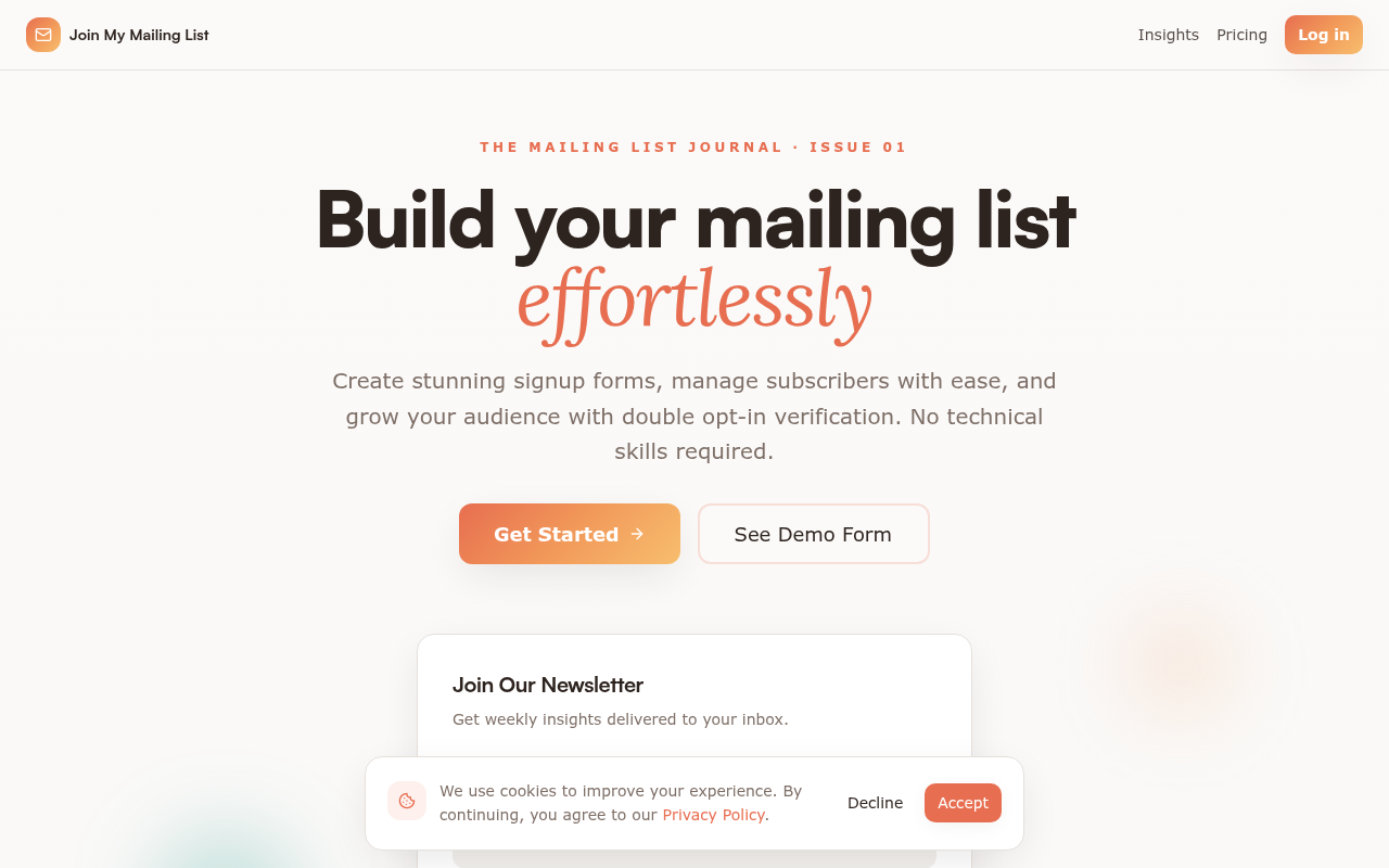
joinmymailinglist.com on a desktop screen, as it first loads
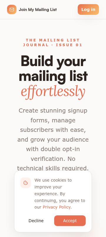
joinmymailinglist.com on a phone, as it first loads

On a desktop

The headline "Build your mailing list effortlessly" lands fast, and "Get Started" is visible and clearly the lead button. What muddies it is the "Join Our Newsletter" card sitting right under the buttons, half covered by the cookie banner. A visitor can't tell if that's their future form or someone asking them to subscribe. Nothing above the fold mentions $2 or that the tool collects subscribers but doesn't send emails.

On a phone

On a phone the headline and subhead fill the screen and the cookie banner covers the rest. Neither "Get Started" nor "See Demo Form" is visible without scrolling, so the first screen has no way to act except Log in, which is for existing users.

  1. 1

    Phone hero, below the subhead

    The four-line subhead pushes "Get Started" below the fold, and the cookie banner hides whatever's left. The only visible button is "Log in".

    Fix: Cut the mobile subhead to one short sentence (or hide the eyebrow "The Mailing List Journal · Issue 01" on mobile) so "Get Started" sits above the cookie banner on first load.

  2. 2

    "Join Our Newsletter" card under the hero buttons

    A real-looking form directly under "Get Started" competes with it and reads like a request to subscribe to the site's own list.

    Fix: Put a small label above the card, like "Example: what your subscribers see", and make its button text clearly demo-only. Or move it below the fold.

  3. 3

    Cookie banner, desktop

    The banner sits right on top of the hero form card, covering its fields and making the first screen look cluttered.

    Fix: Pin the banner as a slim bar on the bottom edge or a small corner box so it doesn't overlap the hero card.

  4. 4

    Header nav, phone

    The bright orange "Log in" is the most eye-catching button on the mobile first screen, but new visitors have nothing to log into.

    Fix: Restyle "Log in" as a plain text link and save the orange fill for "Get Started".

Hero options· 3

Three ways to write the top of the page

  • Clear scope, low price

    Signup forms and a clean subscriber list for $2 a month

    Build a form, share one link, and collect verified subscribers with double opt-in. Export them to CSV anytime. Sending emails happens in your own email tool or our sister products.

    Create my first form

    Use this if the biggest risk is people signing up expecting a full newsletter platform and then feeling misled.

  • The fake-signup problem

    Stop collecting fake emails

    Every signup confirms by email before it counts, so bots and typos never reach your list. Custom fields, a QR code for your form, and one-click CSV export. $2 a month.

    Start collecting real subscribers

    Use this if your visitors have already been burned by spam signups or bad deliverability elsewhere.

  • Try before paying

    Build your mailing list without touching code

    Try the real signup form below before you pay a cent. When you're ready, it's $2 a month for unlimited lists and subscribers. Cancel anytime from your account.

    Try the demo form

    Use this while you have no testimonials yet, so the hands-on demo does the convincing that reviews can't.

Button and link text· 7

What each button should say

  • Hero, primary button

    Get StartedCreate my first form

  • Hero, secondary button

    See Demo FormTry the demo form

  • "Join Our Newsletter" form right under the hero (rename the heading so visitors know it's your own list, or move it to the footer)

    SubscribeGet our weekly list-building tips

  • Demo form in "See a real signup form in action"

    SubscribeTry it (nothing gets sent)

  • Pricing card, Pro plan

    Get StartedGet Pro for $2/month

  • Final section, "Ready to Grow Your Audience?"

    Get StartedStart my list for $2/month

  • Final section subline above the button

    Join thousands of creators building their mailing lists the simple way.Set up your first form in a few minutes. Cancel anytime.

The checklist

What to do this week, and what comes next

This week

  • Remove the "Join Our Newsletter / Get weekly insights" form from the hero, or move it to the footer under the label "Our own newsletter (optional)".

    Low effort High impact

    It sits right under "Get Started" and makes visitors wonder whether they're subscribing to someone's list or starting their own. One clear next step in the hero beats two.

  • Change the hero "Get Started" button to "Start my list for $2" and add a small line under it: "Cancel anytime. Your list exports as a CSV."

    Low effort Medium impact

    The pricing page shows the Free tier can't create lists or collect subscribers, so "Get Started" really means a $2 payment. Saying so up front stops the bounce that happens when visitors land on a Stripe form they didn't expect.

  • Expand "GDPR Ready" into two short lines: "Every signup confirms by email, so you have a record of consent. You own your data, and deleting your account removes it permanently." (from the Terms page)

    Low effort Medium impact

    Trusting a $2 tool with your audience's data is the real risk here. Concrete data terms do more than a badge, and they don't need a face or a name.

Next

  • Earn your first real proof: email your 1 to 20 sign-ups and ask one question, "What were you using before, and why did you switch?" Post two or three answers with first name or initials and their list type (e.g. "R., pottery studio newsletter").

    Medium effort High impact

    Nothing on the page vouches for the tool. A few small, real quotes beat any "thousands" claim, and initials keep things low-key, in line with your own anonymity.

  • Add a short FAQ above the final "Get Started": Can I send emails here? Does it work with Mailchimp, Kit or my current tool (via CSV)? What happens to my list if I cancel? How do refunds work (case-by-case, per the Terms page)?

    Low effort Medium impact

    Each of these hesitations came up in the diagnosis, and each is a reason someone leaves without paying. Answering them next to the button costs you nothing.

  • Add a line about who keeps the lights on, without names: "Built and run by Synergy, the team behind Beautiful Inbox and Supercharged Email. Live since [year]."

    Low effort Medium impact

    "Will a $2 tool still be around next year?" is a fair worry. Tying the tool to a family of working products answers it while you stay anonymous.

In your account you tick these off as you go, and your dashboard shows your progress and the next fix.

Then, a free re-check

Within 30 days of buying, run one free re-check. We read the page again and tell you what's fixed, what's still open and anything new, with the number of conversion blockers before and after. You can also copy the whole plan as text, save it as a PDF, and we email you a copy.