Site Checkups report
beautifulinbox.com
Visitors can't tell whether this is a free tool library or a paid done-with-you service, and nothing proves the team behind the service delivers.
Held back
Visitors can't tell whether this is a free tool library or a paid done-with-you service, and nothing proves the team behind the service delivers.
7 points from 2 blockers. 2 blockers can stop people from buying, and 11 things make people hesitate. The grade weighs each blocker by how serious it is.
Fix these first
In order. Each one keeps its number where it appears in the report.
- Fix first, number 1Blocker, 4 of 5There's no proof the service works: no client names, case studies, testimonials, campaign results or named team members anywhere on the page.
- Fix first, number 2Blocker, 3 of 5The page never states plainly that the core offer is a paid managed service and how it's priced or packaged.
- Fix first, number 3Trust gapStats on the page belong to sample copy ("saves our users an average of 3 hours per week", "10x'd our signups"), not Beautiful Inbox's own results, so open-rate promises like "Get better open and click rates" go unbacked.
Conversion blockers· 2
No proof the service team has delivered for anyone.
The grade comes from these alone, each weighted from 1 (minor) to 5 (critical).
- Fix first, number 1
There's no proof the service works: no client names, case studies, testimonials, campaign results or named team members anywhere on the page.
Serious, 4 of 5. Many leave over it.
Handing over your email list, brand voice and sending to an outside team is a high-trust purchase, and claims like "campaigns that actually perform" mean little without someone vouching for them.
The principle behind thisSocial ProofWhen people aren't sure what to do, they look at what people like them did.The research behind it → - Fix first, number 2
The page never states plainly that the core offer is a paid managed service and how it's priced or packaged.
Significant, 3 of 5. A real share are lost.
Visitors who fit can't judge whether this suits their budget, so many won't bother contacting a team they can't size up.
How your page reads
What a first-time visitor takes away
To a first-time visitor
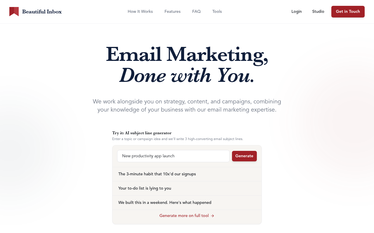
The headline promises a hands-on partner, then the page fills up with a subject line generator, dozens of tool cards, templates and industry lists. A visitor looking for help running campaigns has to dig to find the service, and one looking for free tools may never realise there's a team to hire. Many will grab a generated subject line and leave.
In the first five seconds
Something about email marketing done with you, plus a free AI subject line tool. Whether it's a service, software or both isn't clear yet.
What visitors think you offer
A free library of AI email writing tools and templates for Campaign Monitor users.
What you actually offer
A paid collaborative email marketing service where a team plans, writes, sends and reports on your campaigns, with free AI tools and templates as a lead-in.
The page reads as a tool library but sells a managed service.
The H1 "Email Marketing, Done with You." sells a service, but most of the page that follows is tool cards, templates and "Recently Added" subject line lists, so the paid offer gets lost.
The principle behind thisSelective AttentionPeople focus on what serves their goal and tune out the rest.The research behind it →The title and templates say "for Campaign Monitor", yet the service copy never mentions it, so visitors on other platforms can't tell if the service applies to them.
The principle behind thisMental ModelPeople carry a picture in their head of how something works, and use it to guess what happens next.The research behind it →The service story ("How It Works", "A Partnership, Not Just a Service") sits deep under the tool and library sections, so service buyers read past a lot of content not meant for them.
The principle behind thisSerial Position EffectFrom a list, people recall the opening items and the closing ones. What's in between slips.The research behind it →
What's working· 3
Keep these as they are
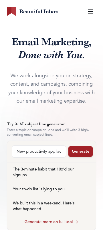
The live "Try it: AI subject line generator" lets a visitor get value in seconds without signing up or talking to anyone.
The three-step "How It Works" ("Share your goals", "We build campaigns together", "We send, you stay in the loop") makes the service process easy to picture.
"No commitment required. Let's chat about your needs." lowers the stakes of reaching out right beside the final "Contact Us".
Visitor hesitations· 4
Cost, platform fit and who does the work stay unclear.
What does this cost me?
The only pricing hint is the FAQ question "How is billing handled?", with no sign of a range or model.
Do I have to be on Campaign Monitor?
The title ties the brand to Campaign Monitor while the FAQ asks "What if I already use an email platform?", leaving the answer unclear.
Who exactly is my 'dedicated email partner'?
The page promises one but never names a person or describes the team's background.
Are the free tools a trap for a sales call?
"Generate more on full tool" and "Get in Touch" sit side by side, so it's unclear what the free side asks of you.
Trust gaps· 2
No named people, clients or results stand behind the partnership claims.
- Fix first, number 3
Stats on the page belong to sample copy ("saves our users an average of 3 hours per week", "10x'd our signups"), not Beautiful Inbox's own results, so open-rate promises like "Get better open and click rates" go unbacked.
The principle behind thisSocial ProofWhen people aren't sure what to do, they look at what people like them did.The research behind it → The only company detail is "Made by" Synergy in the footer, with no about info, location or people, so the business behind the partnership feels faceless.
Button problems· 2
Tool and service buttons compete with no clear main step.
"Get in Touch", "Contact Us", "Explore Free Tools", "Try Free Tools", "Try Tool", "View all tools" and many "Explore" links all pull in different directions, and the text doesn't make clear which step matters most.
The principle behind thisHick's LawThe more choices people have, and the harder they are, the longer it takes to decide.The research behind it →"Get in Touch" and "Contact Us" don't say what happens next (a call, a proposal, a quote), so committing feels vaguer than it needs to.