Site Checkups report
mightyarmy.com
Founders can't find any client work or any named people behind the studio, so the live products alone don't prove they'd deliver for someone else.
Mostly clear
Founders can't find any client work or any named people behind the studio, so the live products alone don't prove they'd deliver for someone else.
3 points from 1 blocker. 1 blocker can stop people from buying, and 15 things make people hesitate. The grade weighs each blocker by how serious it is.
Fix these first
In order. Each one keeps its number where it appears in the report.
- Fix first, number 1Blocker, 3 of 5There's no client work, client name or testimonial anywhere. All proof is self-initiated products.
- Fix first, number 2Trust gapNo people. No founder, no designer bios, no 'who you'll work with'. For a senior-designer-for-a-stretch pitch, that's the main thing being bought.
- Fix first, number 3Button problemEvery CTA is an email address. The 'no form, no call' framing is clear and some people will like it, but a visitor on a phone or without a mail client set up hits friction with nothing else to fall back on.
Conversion blockers· 1
All the proof is the studio's own products, never client work.
The grade comes from these alone, each weighted from 1 (minor) to 5 (critical).
- Fix first, number 1
There's no client work, client name or testimonial anywhere. All proof is self-initiated products.
Significant, 3 of 5. A real share are lost.
Founders hiring a studio want evidence it can deliver against someone else's goals, deadlines and constraints. Without that, a real share of qualified visitors will keep looking for a studio that shows client outcomes.
How your page reads
What a first-time visitor takes away
To a first-time visitor
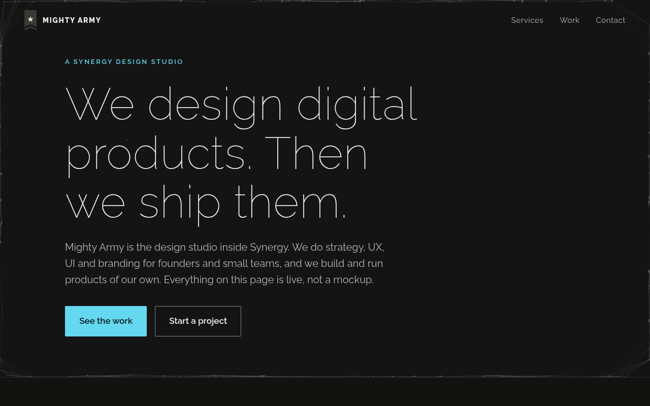
It reads as a confident, no-nonsense design studio that actually ships things, and the H1 says that in eight words. Then the Work section turns into a catalog of games, gradient tools and printables, and a founder looking for a design partner can start wondering whether this is a studio or a product company with a side service. Nobody's likely to bounce in confusion, but some will scroll the portfolio and never see themselves in it.
In the first five seconds
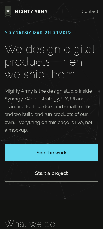
A design studio that does strategy, UX, UI and branding for digital products, and builds its own live products too. Who it's for (founders and small teams) lands in the first paragraph, so that part comes through quickly.
What visitors think you offer
Hands-on product design help from a small senior studio, with proof in the form of real shipped products.
What you actually offer
Strategy, UX, UI and branding engagements for founders, small teams and larger teams pre-redesign, usually starting with a small fixed piece (a ranked product read or one flow) and growing into scoped, priced multi-week stretches. Initiated by email.
The portfolio shows side projects, not work for clients like the visitor.
All eight Work items are the studio's own products. A visitor who wants to know what the studio did for a client like them finds nothing, so they have to infer client capability from side projects.
Several portfolio pieces (daily games, One Page Toys, printables) are far from the B2B or SaaS products many founders are building, which can make the studio feel more hobbyist than it is.
The page sends people to synergyprod.com for 'the consulting side', which muddies whether Mighty Army itself is the consultancy or a slice of something bigger. Visitors may not know who they'd actually be hiring.
What's working· 3
Keep these as they are
The H1 "We design digital products. Then we ship them." tells a visitor what the studio does and why it's different in eight words.
The Start a project section lowers the bar to act by saying exactly what to send ("a paragraph about what you are working on and what is in the way") and promising a plain read back.
Describing the first engagement as "one small, fixed piece" with bigger stretches "scoped and priced before it starts" makes hiring them feel low-risk.
Visitor hesitations· 5
Visitors can't tell who they'd hire, what it costs, or how fast replies come.
Have they ever designed for a paying client, or only for themselves?
Who are the actual designers? There's no name or face anywhere on the page.
What does the small fixed first piece cost? Even a ballpark would tell me if I'm in range.
Is Mighty Army separate from Synergy, and does that matter for who I work with?
How fast do they reply to the email, and is it a person or an inbox?
Trust gaps· 4
No people, testimonials or usage numbers stand behind the claims.
- Fix first, number 2
No people. No founder, no designer bios, no 'who you'll work with'. For a senior-designer-for-a-stretch pitch, that's the main thing being bought.
No testimonials, client logos or quotes from anyone who's worked with them.
No usage numbers on the live products (users, plays, downloads), so 'it's live' doesn't come with any evidence that it worked.
No location, team size or years in business, which leaves the studio feeling anonymous.
Button problems· 3
Email is the only way in, and one link sends people offsite.
- Fix first, number 3
Every CTA is an email address. The 'no form, no call' framing is clear and some people will like it, but a visitor on a phone or without a mail client set up hits friction with nothing else to fall back on.
'See everything Synergy has built' sends interested visitors off to another site mid-decision, and there's nothing that brings them back to this offer.
'Start a project' appears several times but the text doesn't say what happens next or how soon, beyond 'we reply with a plain read', so the commitment still feels a bit vague.