Find out why your website isn't bringing you customers
Paste your homepage. In under a minute you'll see what a first-time visitor sees, where they hesitate, and what's stopping them from buying.
A real review of one of our own sites
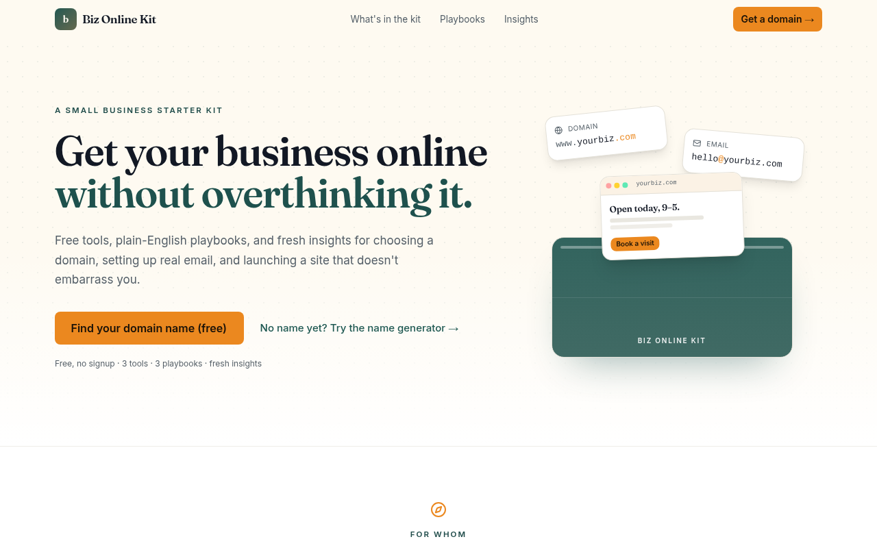
This is bizonlinekit.com. The notes are condensed from the Growth Plan Site Checkups wrote for it, screenshots and all.
- 1
Two loud buttons, two different labels
The header's "Get a domain" looks just like the main button, so it isn't clear which one is the first step.
- 2
The only reassurance is small and gray
Nobody reads it, and it says "free" right next to a path that ends in a purchase.
- 3
The heaviest block says nothing
The big green box pulls the eye, but it's blank apart from a small label.
- 4
Empty space hides who it's for
About 150px of blank space under the hero pushes "For whom" below the fold.
Your free report
Written for the person who runs the site, not for a developer. Every finding says what's wrong and why it costs you, in words you can act on.
First impression
What a stranger thinks your business is in the first few seconds, in plain words.
Offer clarity
What visitors think you sell next to what you actually sell, and where those drift apart.
Visitor hesitations
The questions running through someone's head right before they leave.
Conversion blockers
The specific problems costing you sign-ups or sales, each rated for severity.
Trust gaps
Proof that's missing: who's behind it, results, reviews, guarantees.
Button problems
Calls to action that confuse, compete, or ask for too much too soon.
A real report, unedited
We ran it on our own site first
Bizonlinekit.com is one of ours. Site Checkups called out that its main button sends people to buy a domain on a page that promises "no upsell," and that nobody can tell who's behind it. Both fair. Both fixable.
Read the full sample report, Growth Plan includedFirst impression
This reads as a friendly, competent starter kit for small business owners, and the tone ("a site that doesn't embarrass you") lands. The mockup of a domain, email and storefront makes the end result easy to picture. The wobble comes when visitors realize the main button sends them somewhere to buy a domain while the page promises "no signup, no upsell," so some will feel baited and bounce.
Top conversion blocker
The primary CTA goes to a domain purchase with no indication of the registrar, price, or that it leaves the site.
First-time owners are wary of being sold to. An unlabeled jump to checkout gets a lot of quick back-button clicks, and that undercuts the trust the copy built.
Visitor hesitation
"Where does 'Get a domain' send me, and am I about to be charged?" Unknown destinations make cautious first-timers freeze.
The Growth Plan, when you want the fixes
The free report tells you what's wrong. The Growth Plan tells you exactly what to change, gives you the words to paste in, and shows you where to click in your site builder. First you answer five quick questions about your traffic, customers and limits, so you won't get advice that only works for big companies.
$19
One-time, per site. No subscription. 14-day refund.
See pricingBefore and after
Hero microline under the CTA
NowFree, no signup · 3 tools · 3 playbooks · fresh insights
Change toSearching is free. If you buy a domain, it's through our partner at their normal price, and we earn a small commission.
Hero option 1 of 3
Get your business online this weekend, without overthinking it.
Free tools and plain-English playbooks for picking a domain, setting up real email, and launching a site that doesn't embarrass you. When you're ready to buy, we'll tell you where we'd go and that we earn a commission.
Find your domain name (free)Your checklist
- Move the "Who's behind this" commission note up next to the hero button as a one-liner: "Free tools. If you buy a domain through us, we earn a commission at no cost to you." Also add a sentence explaining Synergy: "Synergy is the small team behind this kit and its sister email sites."
- Fix the H1 spacing so "online" and "without" don't run together, and make sure the newsletter button reads "Email me new guides" everywhere (drop any leftover "Get the kit").
- Add a short "What it'll cost you" box near the playbooks: domain about $10–20/yr, professional email about $X/mo, one-page site $0–$X/mo, with the renewal price called out.
Steps for your site builder
Replace the hero text
Open the editor for your homepage (look for Pages > Home > Edit). Click the H1 and subheadline in the top section and paste in your chosen hero option. Check the preview for the 'onlinewithout' spacing bug and add a real space or line break if it's still there.
Also in every plan:
- A look at your page on desktop and phone
- Three hero options
- New button text
- Five FAQ answers
- A better search snippet
- Notes on up to two competitors
- A free re-check within 30 days
- Copy as text, save as PDF, emailed to you
How it works
- 1
Paste your homepage
Any public page. No account, no install, no tracking code.
- 2
Read the diagnosis
Under a minute later you'll see what visitors understand, what worries them, and what blocks them.
- 3
Unlock the fixes if you want them
$19 gets the Growth Plan for that site. Or take the diagnosis and fix it yourself.
Who it's for
- Founders whose traffic isn't turning into sign-ups
- Small business owners who built their own site
- Marketers who need a second opinion before a launch
- Agencies who want a fast, honest read on a client's page
Free guides
What our reports keep finding, written up so you can fix it yourself.
4 min read
Write a homepage headline that says what you do
Most homepage headlines are clever, vague or about the company. How to write one a stranger understands in five seconds.
5 min read
How to earn trust when you'd rather stay anonymous
No founder photo, no team page. The trust signals that work without a name or a face.
5 min read
Too little traffic for A/B tests? Do this instead
Under about 5,000 visitors a month, a split test can take a year to tell you anything. How to find what's wrong this week.
The homepage checklist
Twenty-four checks you can run on your own page in fifteen minutes. Tick them off as you go.
Questions
How does it work?
You paste your homepage address. Site Checkups reads the page the way a first-time visitor would (headline, offer, buttons, proof) and an AI reviewer, briefed the way you'd brief a conversion specialist, writes up what's getting in the way. It takes under a minute.
Is the free report really free?
Yes. You get the full diagnosis with no sign-up and no card, up to 3 new reports a day. Reports you've already run stay free to view.
What do I get for $19?
The Growth Plan for that site: before-and-after fixes with the exact words to paste, a look at your page on desktop and phone, three ways to write your hero, new button text, FAQ answers, steps for your site builder, a checklist, and a free re-check within 30 days. You can add up to two competitors to compare against. Before it's written you answer five quick questions (your goal, visitors, customers, audience, and anything to avoid), so the advice fits your business. You can copy it as text, save it as a PDF, and we email you a copy. It's a one-time payment per site, not a subscription.
What if it isn't useful?
Email hello@sitecheckups.com within 14 days and we'll refund you in full. No form to fill in.
Is this an SEO or speed audit?
No. Plenty of tools check page speed, broken links and search rankings. Site Checkups looks at whether the people who do arrive understand you, trust you, and know what to do next.
Which pages work best?
Homepages and landing pages that anyone can open without logging in. Pages that build everything with JavaScript after loading may show less text to the reviewer, which the report will reflect.
See your site the way a stranger does
Free, in under a minute.